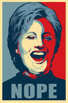
It's interesting to me that just in the matter of style, the Obama camp is sending out entirely different messages than that of the Clinton group. When I say style, I don't mean rhetoric or talking points, I mean the look and feel of the respective candidates--the visual messages that are being sent out to establish the viability and the memorable aspects of the individual candidates. In consultant speak, which I find highly tedious, its branding. To my thinking, it's personality. Now, some of this image building may be grassroots--but as it is additive, is it built on a foundation established by the respective candididate's spin meisters? Or is it just a vibe individuals have picked up on, responded to and because the candidate independent of spin, projects an image that is easy to understand and package. To that point, we have Jim O'Brien working on images of the candidates (as seen earlier this week) and we have Shepard Fairey (Obey Giant) creating a poster for Obama.
Shepard Fairey, who you all have heard me rave about, is an entrepeneurial illustrator/graphic designer with many feathers in his cap from his commercial work (best known in the worlds of skateboards and movies "Walk the LIne" poster), his urban art and installations to his fine art print business and his Obey line of clothing. He has recently opened a gallery and is now marketing this Obama poster under a new dba known as "Subliminal Projects". I had assumed that he had been contracted by the Obama camp to create this poster (sold as an offset poster, different than his signature screenprints, $30. a pop, 24"x 36")--but there is no mention on his site. I googled the same--to no result. It is perfect Shepard Fairey without the textures and layers of imagery that often takes his simple likenesses to another place (the Peace women for example). However, if you take this out of the Shepard Fairey context and look at it in the wide swathe of image building amongst the candidates--there really hasn't been a representation of a candidate on a poster for decades. We just don't need to do it with the internet, news media, television, youtube. .. You get the idea. We are barraged by this stuff. To think, though, that this illustration of Obama wouldnt seem special, but it is because it is a new media--for most--and the interpretation of this likeness into a simple, memorable signature for the candidate is striking. The type is simple and elegant...and the most impresive thing is that his name isn't even on the piece. The word HOPE is emblazoned simply at the bottom of the page, picking up the obama O with the striped horizon as the clue insofar as who this person is. Fairey is assuming you know who this is. And to that, he appeals to those of us in the know--that the message is Hope and this is the person who will bring it. Now, I am pretty bored with all this democratic stuff...and feel that the candidates are a whiskers difference so style is the thing that may make the difference here.
There is a parody of the Obama poster floating around--for Hillary. That camp needs to get moving on this..or maybe its too late. The pictures of the Hope posters in PA--lining a room, hanging off chairs, people holding them up have taking this illustration to another place. It has now integrated with the imagery of the candidate. A bit flat footed that the Clinton folks didn't immediately respond. This sort of thinking, old traditions made new--a fresh approach from a messaging and delivery standpoint, will hold Obama in good stead. As illustrators, we should all get off our haunches and engage. There are strong pictures to be made, to get out there and to fuse to the bigger picture (world issues, local issues, personal issues) and we can make a difference. Shepard Fairey has.
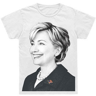
Note: The Clinton Camp's response was to get Marc Jacobs to do a teeshirt>>
My response is that maybe, just maybe, each camp needs a visual strategist in the future. Hands down, the Clintons missed the boat. I mean, I am a girl and I wouldnt wear a damned shirt with a lady with pearls with her mouth open as a billboard or as fashion. How dumb. And men?
