Common Threads

The Green Man 2, Q. Cassetti, 2011 pen and inkGrassroots was a different event for me this year. Grassroots was a highly social few days mixed in with a little dancing, a lot of listening, and laughter. normally it has been long days of non-stop listening, hot and furious amongst the hoards of the great unwashed ( true in both counts). There is some charm to that, but oddly, I have discovered that I am not a shirtless “bro” looking for as much cold, cheap, beer (for you bro aficionados , read “natties”). I am not looking for a hookup on the dance floor or to spend the weekend ” in the bushes”(as a mom mentioned that her child spent the festival there). I leave that to my son Alex to fulfill that role.

Grassroots was this year about community and about the musical DNA that Trumansburg and Ithaca have ingrained in it’s culture. We live in a small area where live music on a very high level can be heard nightly for free or a nominal charge. These are professional musicians with conservatory training, and some self taught but in the tradition of the area, decided early that music was central to their being…and started street performing in their teens. Some make their livings being musicians, while many others have day jobs in libraries, schools, moving companies, food concerns bringing that right brain viewpoint to the everyday as well. This is the thread of music, from the people and their ethos to the actual art performed.

I am honored to have gotten to know some of the most vibrant musical brains in the area, and am charged up by their focus and commitment to music as the spine of their lives, the spur to live and continue to grow that I am questing for as are others of our tribe. It is so curious to quiz people about their backgrounds, their training, their lives as musicians and performers. It has made me better understand the artistic “thing” that moves us all forward— the quest for inspiration, the strength of solo work and for some, collaboration; the timing and sequence, the need to get the work out and seek insight and and reception. Regardless of the channel of the arts— whether it be visual or auditory— these are some common threads we share.

Look at what the pros are doing

Images drawn on an iPad by David HockneyIf I were Alex Cassetti, I would exclaim that David Hockney is “fresh as hell”. This is an unafraid artist who paints about everything that touches him from his lifestyle with pictures of men in swimming pools in Los Angeles to his new and exciting pop in the iPad art world. I love it that Hockney has been drawing on his iPhone and has newly adapted the pad (down to having coats made with big interior pockets to hold the pad). He has exuberantly leapt on the technology, making new pictures that have merit on their own, and not trying to be anything than what they are. He creates images daily and emails them out to his friends just because…and this resonates with me. So, inspiriation is there. Just get going. Keep drawing regardless of the medium. It will look like you because, silly, it is you.

“Who would have thought that the telephone would bring back drawing?”  David Hockney

“I realized when I was doing the sunrises last year that it was partly because the iPhone was beside my bed when I woke up,” “But if I’d only had a pencil and paper there I probably wouldn’t have chosen to make pictures of the dawn.”  David Hockney

And so today begins. Recycled soup (bean as the base…tomatoes added as well as some chicken) ready for the back porch crew. I made two cornbread loaves last night while I joined the world watching the amazing and to me, frankly pretty scary/horrifying venture in Chile to get the miners out. That tube, the rescue contraption called “Phoenix 2”, 26” x 6’ being lowered into the ground essentially with a jerry rigged rope tow, with either a miner or a rescuer squeezed in, coffin style with air and (I hope some medication) to make an uncertain journey (180 feet of it encased in a metal tube as the ground was uncertain towards the top of the shaft). The chanting of Chee Lay by those above and below as if it was a game, interestingly, instead of buoying my spirits, made me chew my lip even harder. Then the elegant Florencio, the first miner up, was instead of having a bit of privacy watched as his dear little son (with a chilean mylar balloon shoved into his hand by some media spinner) break into heart wrenching tears when his papa surfaced. And the media circus surrounded this poor soul who needed a beer and a chance to put his head down, hold his family’s hands and say a big prayer that he was out of that subterreanean prison and his comrades would make it too. There was nothing about this enterprise that spoke of any of this being a “sure bet”— but the quiet confidence of those surrounding the entrance to this shaft was reassuring even to this nail biter. I hope that today brings more confidence, more rescues and closer to this amazing story of these men below the ground.

Sure make the small stuff seem pretty silly, doesnt it?


Black and White

I have been looking at antique silhouettes and Pennsylvania scherenschnitte. I am surprised and happy as they have a relationship to some of the inked flopped illustrations and patterns I have spinning out..and feel that the narrative aspects of this artwork (example above) I can learn from. I am delighted by the rambling lines, the erratic trees and buildings with tons of detail but still staying as bold and graphic that they are. I am thinking of trying to draw some of these (maybe using the example as a place to start). I discovered a few illustrators that seem to be working in this same vein. One, Rob Ryan, who Daniel Schwartz from the illustration program at the University of Hartford pointed me to. I love his whimsey and fun along with incorporating a whackdoodle font/type into his image. Drawn, the illustration and cartooning blog tips their hat to Mr Ryan>> Here's another great one from the blog, "I heart art heart illustration" Ryan has a shop in London of his work>>. The Creativity Blog has a great article (with a picture of Rob Ryan) here>>. I am inspired by him, his work, his vision and his entrepeneurism. Big old kick in the booty for me.

Thrilled. The Hangar likes the posters. One down. Three more volunteer jobs to go. Am making progress on the other images too....it just takes time. Am enjoying the stuff on the desk. The folks at Zazzle's ArtProjekt are developing a new product that I am thrilled about. They contacted a bunch of designers and illustrators to help customize this thing...which was very fun for me (albeit its quick) and I am pumped about. This is going to be a real star. As soon as I can tell you about it, I will as its something we all will want!

More later>>

Sunday redux


I apologize for being so silent. It just been too much with the work at hand (endless variations on a similar thing to finally get to the end, plus new stuff with 2-3 hour turn arounds that can really be trying). It really is quite a bit to stay on top of that pony, blog and just get the day to day resolved. I will try to be more communicative this week.
Yesterday (and I will post the pictures later) we visited Durand's Forge, the blacksmith shop and world of Durand Van Doren, an amazing artist, clever and funny person, generous host and remarkable blacksmith. He works outside of Mecklenburg in a few small buildings heated by big woodstoves, with his work, his collections, his inspirations all nailed to the wall or arranged in little story telling vignettes that depict an active brain, a wit and humor that goes with the work. He showed us gates and benches he had done on commission along with enormous groups of chandeliers and lighting for Cornell and other big institutions. But he also had a wrought iron Kissing Booth and Good Luck Bench (made from horseshoes)... There was a lovely named dog house for his little confident Jack Russell, Mick--along with all sorts of personal totems posted on the wall around Mick's abode. Duran had mini forges in the yard to the back of the shop where he teaches blacksmithing...all sorts of machines made of this and that to create small approachable forges. He had a pot of beef stew going on one of them...and kindly offered us this hospitality along with his stories and ideas. He had all sorts of fruit trees (which Kitty identified confidently, thanks to the kindness of Ian and Jackie Merwin's tutorial)) and a real live chestnut (not horse) tree with it's nuts standing proud in the spiky shells.


Durand is a man of many talents. He is a big Trumansburg Rotarian..a giver and there at the chicken barbeques, the golf events, the races, the meetings. He always gives when people need things for auctions and raffles. He also is one of the refs at our only Pro Sport in Ithaca, rollerderby with the SufferJets. He is a remarkable artist--and his world at the studio invites you into his thinking, ideas, and life. If you have a chance, or just an hour, I highly recommend you visit Durand next weekend during the second weekend of Ithaca Art Trail.

We then, visited friends in the Cayutaville area. They have recently built a studio/ house compound--with lovely porches springing off each level to overlook a spectacular valley (which yesterday with the Fall colors was dumbfoundingly beautiful). Their work space was great, and their living space, equally so...with vibrant color on the wall--unexpectedly wonderful, and the beautiful cabinetry and woodwork creating a very happy place to spend all your days. They have a wonderful, happy garden with an enclosure as happy as the parsley framed walkways, energetic nasturtium, a pineapple sage...all poetry...abutting the most perfect chicken coop with tailored black chickens happily chasing each other down one end of their run and back again. Shady Grove was with her best dog girlfriend...and enchanted by the chickens. She didnt know what to make of them. We were so honored to have a chance to visit these lovely kind people in their paradise as well. And, on such a beautiful day--with the evening sky moving from blue to purple with red edges in the sky, to shimmering gold trees. Breathtaking.

And to cap it off, we went to see Julie and Julia at Cinemopolis. Bliss..and a gumdrop to finish a wonderful day of seeing and meeting, color and light, ideas and brilliant work. What a blessing we have .

A Labor Day Gumdrop!


A break from Fraktur. The images above are screen captures from the most inspired little film I saw last night. It is Nina Paley's autobiographical "Sita Sings the Blues", an interwoven story with interwoven techniques and voices (many very cute and funny) about a woman's break up with her husband after he is sent to India to pursue his career...and the story of Sita and Rama with a thick overlay of this boop boop da doop love sing/songs from Annette Hanshaw. It is a must see for all of my illustration friends as it charms with color, wit and the clever use of cut paper, shadow puppets (as the narrators), stock art and of course the drawn media. It makes a very strong vote for the world of vector and how lovely it can be. Plus, this is a rich and inspiring slice for all of us. The under 20 set here went wild. It is an inspired gumdrop personal to Nina Paley, a real star and creative who is the writer, creator, animator of this singular gem...We should expect to see more from this thoughtful, fun, visual artists...and I hope soon. You all know how I feel about Indian art, and this was such a unexpected gift delivered to us in a mention from the tuned in Mr. David Lucas, designer and astute observer of the world. Thank you David for this wonder! We are all beneficiaries of your suggestion!

If you go a bit deeper into the copyright issues surrounding this work which I will allow Wikipedia to explain clearly:

In the 1920s Annette Hanshaw recorded the songs that director Paley used in the film. These recordings were protected by state commerce and business laws passed at the time in the absence of applicable Federal laws and were never truly "public domain".[12] In addition, the musical composition itself, including aspects such as the lyrics to the songs, the musical notation, and products derived from using those things, is still under copyright.[13] In the case of this film, the syncing of the recording with the movie is the infringing act.
Without a distributor, Nina Paley was unable to pay the approximately $220,000 that the copyright holders originally demanded. Eventually, a fee of $50,000 was negotiated. Paley took out a loan to license the music in early 2009.[1]

Unorthodox distribution
Due to terms of the music license, one limited DVD pressing of 4,999 copies will be printed. The film was released for free download starting in early March, 2009 "at all resolutions, including broadcast-quality, HD, and film-quality image sequences", licensed under the Creative Commons Attribution-Share-alike 3.0 Unported license.[14] The freely downloaded files will count as "promotional copies" and will thus be exempt from payments to the copyright holders of the songs.[1]


The full film can also be viewed in low-resolution streaming video on the web site for WNET, a PBS member station in New York City. WNET broadcast the film on March 7, 2009.
Nina Paley plans to make money through voluntary payments, ancillary products, sponsorships, voluntary payments from public screenings, the aforementioned limited DVD sales, and possibly other methods.[1]
A cornerstone of the distribution model is the "creator-endorsed" logo, developed by Nina Paley in cooperation with QuestionCopyright.org. Although anyone is free to distribute the film, distributors who do so while giving a part of the profits to the artist can get the artist's endorsement and use the "creator-endorsed" logo on their promotional materials.[15][16]

so you can download the film, watch it on YouTube
Not much labor for Labor Day. We are wrapping up the perishable foods and getting the wheels in motion for school. Rob is off to France, Amsterdam and Germany (a ten day trip) starting Wednesday. Alex is having a birthday "Sausage Fest" complete with tee shirts and games next Saturday. So, things are likely to be a bit more Tburg centric until R. comes back.

Sunday 08.23.09

Spent the morning chatting with David, our guest...with him painting a landscape and me fiddling around with my pens. We looked at the work of third generation puppeteer and performance artist, Basil Twist (on youtube>>). Twist is imaginative with his use of screens, film, projection, curtains (the stagemanship) along with his puppets and aspect of his work that might fit into performance (active costumes that help the artist to go to another place. The first film is of his performance, Dogugaeshi,commissioned by the Japan Society and is beautifully described (in the link) by the New York Times.

Twist joined another performance artist who David has been following for years since David claims to have seen in a window of the New York Fiorucci store, Joey Arias.

Arias and Twist presented "Arias with a Twist" off Broadway to David's delight...with this collaboration moving to Los Angeles soon. Arias is an artist who can span gender, age and go from nice to naughty in a blink of an eye. Marvelously funny, poignant and quite a presence, Arias was a featured performer with the Cirque du Soleil presentation, Zoomanity. David made the pilgrimage to Los Vegas for his fiftieth bday to see this Cirque show and take in the LV sights. We looked at YouTube clips on both Twist and Arias which was fun and very inspiring as well.

We visited Petrune, a great vintage clothing store on the Ithaca Commons as well as my new favorite antiques store next to the State Theatre, Blue Bird Antiques. Jenny MacGuire, the owner and buyer has similar interests to mine and always captures the imagination from Odd Fellow and Mason stuff, to circus posters, religious stuff, primitive ephemera to taxidermy. Doesnt get much better. Jenny mentioned that we may have a monthly antiques auction in little ole Tburg at the VFW. This would be a real
ly good add...and what with the activities around the old/new Rongo, things are looking up! (not that they ever looked down, but more in the case of T burg is better).

We attended the Ithaca Sufferjets Bout with Wilmington and left at halftime as we were tired and hungry. Shady got a little walk in Cass Park discovering the dog drinking fountain. We had a late dinner and then to sleep. This morning I used up the two soft bunches of bananas making banana bread (double order) and a banana cake from Joy of Cooking. I chopped up all the left over chicken from this week and made a rather lavish chicken salad (with new and left over ingredients and the pepper bacon we had at breakfast). So, cooking is done and we are planning a later afternoon showing of Ponyo at Cinemopolis. We will see what happens from there.

swirling in ideas


Flower paintings, Ambrosius Bosschaert (1573-1621) a Flemish-dutch painter. Note: a Pila sp. shell is situated at the right corner.
So the fiddling with the frame and a reverse flower thing has spurred me to look at Ambrosius Bosschaert's paintings of flowers and bugs and the promise of the season that these blown out florals make. I am liking making these borders and need something for them to border or better, once on track, have the borders match the subject and vice versa. But for now, I am amused, researching and not too serious about anything illustrative. Bosschaert's paintings are simple compositionally, simple forms and yet they speak to me of lush summers and springs, the wealth of nature and for the dutch, the wealth generated by their trade in tulip bulbs. So, that said, have that plate and interest spinning.

Additionally, I am reading up on Fraktur. Wikipedia says:

Fraktur is both a style of lettering and a highly artistic and elaborate illuminated folk art created by the Pennsylvania Dutch (also known as Pennsylvania Deitsch or Pennsylvanian German). Most Fraktur were created between 1740 and 1860.

Fraktur drawings were executed in ink and/or watercolors and are found in a wide variety of forms: the Vorschriften (writing samples), the Taufscheine (birth and baptismal certificates), marriage and house blessings, book plates, and floral and figurative scenes. The earlier Fraktur were executed entirely by hand, while printed text became increasingly common in later examples. Common artistic motifs in Fraktur include birds, hearts, and tulips, as well as blackletter and italic calligraphy.

Today, many major American museums, including the Metropolitan Museum of Art and the Philadelphia Museum of Art have Fraktur in their collection. Important Fraktur have been sold by major American auction houses and antique dealers for prices in excess of $100,000. The definitive text on Fraktur is widely considered to be The Fraktur-Writings or Illuminated Manuscripts of the Pennsylvania Germans, written by Dr. Donald A. Shelley and published by the Pennsylvania German Society in 1961. In late 2004, part of Dr. Shelley's Fraktur collection was sold at public auction in Pennsylvania for $897,833.

Interesting time period, no? Sort of overlying the early American gravemarkers you all know I love--spanning through the writings of Jane Austen and like writers, through the civil war. So, its pre Victorian and then at the end promises that time. However, on the early side, this is similar imagery to that of the early funerary art. There is a great website Fraktur Web that explores the known Fraktur illustrators and shows how one informed or taught the other in this very limited geographical area. Additionally, this site details the types of Fraktur work that was created. Simply put, Fraktur had a use and a place to note and commemorate things in people's lives. Fraktur was used to embellish/design / detail hymnals, bookplates (for awards of merit); religious broadsides, house blessings (Haus-segen) and purely pictorial works all received the fraktur treatment. As early as 1772, the Ephrata Cloister brother and sister calligraphers were turning out the “Goldene ABC,” an inspirational work. Iluminated birth and baptismal certificates are the most numerous fraktur (Taufschein Fraktur). The other, Vorschrift fraktur were "best examples certainly are the most inspired marriage of writing and illumination within this art form. The fraktur Vorschrift is a model for writing exercises often drawn by schoolteachers and particularly popular among Mennonites and Schwenkfelders. Consisting of Biblical verses or hymns, they were used in the parochial schools that pre-dated the founding".

These symmetrical illustrations fascinate me as they are part of a culture of a small group of people, illustrated by known calligraphic illustrators or illustrative calligraphers..creating pieces that were noteworthy as images but that were significant in recognizing life's progression and the recognition of those key moments in a graphic way. When I was younger, my mother had found these printed marriage certificates that were rendered in a fraktur manner that she would have me ink in the names in blackletter to match the spirit of the certificate. I am thinking that there may be a place to develop some illustrative marriage and birth certificates in the same manner for sale of my own work (inspired by the Pennsylvania Germans or by any other whimsical birth or marriage images that strike me). These could be letterpressed into rich, all cotton paper and packaged in a beautiful way. This is a saleable idea...and will allow me to explore this form with a few goals in place.

Today--more pushing of the teenagers. More work and a guest arriving for a two night stay. Alex is love/hating the preseason crosscountry, but there is talk he may be a varsity runner. We got everyone's schedules worked out with Alex getting a roster of great teachers and his two top picks--guitar lessons and Music Theory. We swapped out 2 of the four AP classes for better/more engaged teachers for Kitty--with English being public speaking and Shakespeare...and the government class taught by a spitfire who has opinions and isnt afraid of dragging his class into conversations. It feels like this is all very positive.

Ammi Phillips, the Border Limner (1788-1865)


New England's austere people are portrayed with grace and humor by the Border Limner, Ammi Phillips


Known as: Folk and naïve (primitive) artist
Born: 1788, Colebrook, Connecticut, US
Died: 1865, Massachusetts
Ammi Phillips began his professional career around 1811. He travelled extensively in the New York - Massachusetts - Connecticut border area, and because of this, became known as "Border Limner".

He married Laura Brockway in 1813 and the couple moved to Troy, New York. At some point they moved to Rhinebeck where his wife died in 1830. He remarried shortly after.

Around 1829, he started painting in a new style. The works from this period were from his "Kent Period", named thus because that was the town in Connecticut where the paintings first surfaced. He probaly did the paintings in New York's Duchess Conty.

He returned to western Massachusetts in 1860 where he died five years later

I was delighted to learn about him from his elegant pink and neutral portrait of a young girl, "Harriet Leavens", we saw yesterday at Williams College's Clark Museum. Albeit, Mr. Phillips was born well over 80 years after the English writer, Jane Austen wrote her celebrated books, the spirit, the simplicity and the styling really reaches over that span of time to embrace her thinking, the styling and the imagery that in my imagination, I sew to her words.

``Miss Bingley,'' said he, ``has given me credit for more than can be. The wisest and the best of men, nay, the wisest and best of their actions, may be rendered ridiculous by a person whose first object in life is a joke.''

``Certainly,'' replied Elizabeth -- ``there are such people, but I hope I am not one of them. I hope I never ridicule what is wise or good. Follies and nonsense, whims and inconsistencies do divert me, I own, and I laugh at them whenever I can. -- But these, I suppose, are precisely what you are without.''

``Perhaps that is not possible for any one. But it has been the study of my life to avoid those weaknesses which often expose a strong understanding to ridicule.''

``Such as vanity and pride.''

``Yes, vanity is a weakness indeed. But pride -- where there is a real superiority of mind, pride will be always under good regulation.''

Elizabeth turned away to hide a smile.

``Your examination of Mr. Darcy is over, I presume,'' said Miss Bingley; -- ``and pray what is the result?''

``I am perfectly convinced by it that Mr. Darcy has no defect. He owns it himself without disguise.''

``No'' -- said Darcy, ``I have made no such pretension. I have faults enough, but they are not, I hope, of understanding. My temper I dare not vouch for. -- It is I believe too little yielding -- certainly too little for the convenience of the world. I cannot forget the follies and vices of others so soon as I ought, nor their offences against myself. My feelings are not puffed about with every attempt to move them. My temper would perhaps be called resentful. -- My good opinion once lost is lost for ever.''

``That is a failing indeed!'' -- cried Elizabeth. ``Implacable resentment is a shade in a character. But you have chosen your fault well. -- I really cannot laugh at it; you are safe from me.''

``There is, I believe, in every disposition a tendency to some particular evil, a natural defect, which not even the best education can overcome.''

``And your defect is a propensity to hate every body.''

``And yours,'' he replied with a smile, ``is wilfully to misunderstand them.''

However, Ammi Phillips is lumped into the folk art category (which I go to interpret as decorative illustration and decorative portraiture) and is in a way pooh poohed as its just a whisker away from primitives (read heaven..the work of the amazing Edward Hicks surfaces immediately).


I am particularly fond of Limner paintings (those portraits done by itinerant painters) as I grew up eating in my grandmother's dining room with two family limner paintings (Henry and Margaret Gibbs(1670) framing the door to the kitchen. Brother and sister paintings were two out of the three (a brother was in the Boston Museum of Fine Arts) and had been in the family the entire time somehow ending up in my grandmother's house in Charleston, West Virginia. These portraits, done by the Freake Limner, had been in my family until my grandmother's time. Upon my grandmother's  death, Margaret was bequeathed to join her brother, Robert already at the MFA in Boston. Henry was given to the Clay Center in Charleston WV. I am descended from Margaret, who was married to Nathaniel Appleton of Salem MA, a merchant. Margaret Appleton and her husband were painted by Copley. Margaret's portrait was given to Harvard University in 1855. Her husband, Nathaniel's portrait is still in the family--a shame they are not together as they are a wonderful pairing. I am a bit puzzled by the dates they cite for Margaret's birth/ death as her limner painting was well over 20 years prior to the stated birth unless this is the next generation (which is possible). The paintings by Phillips sets my mind to whirring over Austen's writing, while the Freake-Gibbs Limner calls the Scarlet Letter to mind...and of course, my beloved early american tombstones. I love how it all tails one into the other.

www.mfa.org says:

The collection of American paintings, over 1600 works, is considered by many to be among the best in the nation. The earliest paintings are anonymous portraits of Robert Gibbs and of Margaret Gibbs, both painted in Boston about 1670.

>Here's a bit more>>

Margaret Gibbs
1670
Freake-Gibbs painter
102.87 x 84.14 cm (40 1/2 x 33 1/8 in.)
Oil on canvas
Classification: Paintings
Accession number: 1995.800
Bequest of Elsie Q. Giltinan

Executed not long after Boston was settled, Margaret Gibbs is one of the finest of the few extant portraits painted by New England artists in the seventeenth century. The artist, who also painted portraits of Margaret's brothers-Robert, age four-and-a-half (MFA, 69.1227) and Henry, age one-and-a-half (Sunrise Museum, Charleston, West Virginia)-is unknown. However, it is thought that he created the likenesses of John Freake and Elizabeth Freake and their baby Mary (Worcester Art Museum) in 1674. He is thus known as the Freake-Gibbs painter and is considered one of the most skilled portraitists of the seventeenth-century colonies, possessing an exceptional sense of design and an admirable feeling for color. Probably trained in provincial England, he painted in a flat style derived from Elizabethan art that emphasized color and pattern.
Margaret Gibbs was the oldest child of Robert Gibbs, an English gentleman who had emigrated from England to Boston in 1658. Robert married Elizabeth Sheafe of Cambridge, Massachusetts, in 1660, and in the same year Elizabeth inherited considerable property from her grandfather. A successful merchant, Robert had their three children's portraits painted in 1670. The depictions of Margaret and her brothers in all their finery are evidence of the materialism and prosperity of the Gibbs family and the remarkable growth of the city of Boston.
In this portrayal of Margaret, the Freake-Gibbs painter has meticulously rendered the seven-year-old's lace, needlework, silver necklace, and red drawstrings and bows. Her sleeves have the single slash allowed by Puritan sumptuary laws. Such finery was only permitted by Massachusetts law if the man of the house possessed either a liberal education or sufficient annual income. Margaret's fan is an indicator of her gender, as children of both sexes were dressed similarly until the age of seven or eight and an attribute was needed to differentiate between images of boys and girls. The pattern on the floor is either black and white tile or, more likely, a wooden floor painted to simulate tiling. This pattern, the dark neutral background, and the inscription of the year and age of the sitter are indications of seventeenth-century Dutch influence on English and subsequently on American art. The period frame of the picture is made from American pine painted black, thus making it probable that it was crafted in New England.

This text was adapted from Davis, et al., MFA Highlights: American Painting (Boston, 2003) available at www.mfashop.com/mfa-publications.html.

Week One, Day Three: Big shapes, big colors


Chris Payne (left), Gary Kelley (right) demonstrated today. Chris showed us his amazing, multimedia build approach from a lovely sketch in prismacolor through the steps of Prisma on board; flesh colored acrylics (mixed with gesso vs white paint) in the head shape to create a form; then a dark tuscan red laid watercolor wash on top of that color. Clean brush picks out highlights with water --pulling them out of the watercolor. Then fix the entire thing. A mix of purple and green oil paint is applied to the background where clouds were pulled out of the color with a needed eraser. More prisma on the face, More
paint...and so on.We are going to be given a video as I didnt take notes. Chris draws with his paint...really a more draftsman's approach versus paint into paint. But the quick results are spectacular. He talks about templates (your tissue sketch and even templates he creates as guides in pulling the highlights). Lots of learning in the patter around his presentation. He also showed his slides and talked about his work which was interesting and important to see his growth and how he is evolving. I like where its going.

Gary Kelley also did a slide presentation of his work which I had seen before, but with this work--it is amazing and really pushes me to think. His presentation was really illuminating. Yes, I saw him in Syracuse--and maybe I was too balled up in my own insecurities to really see what was going on...but yesterday! WOW. Gary is contantly designing his composition, thinking about art, art history, palettes, form. He is inspired and motivated by shapes and colors--With that knowledge a switch flipped in this dim skulll that I do that too...and that maybe this abstraction thing might be a wonderful pursuit. With his demo, (a pastel (hard, neupastels on a natural colored stonehenge paper), he worked with a very simple design with his tissue sketches as reference. Then, without planning he dives in for the illustration party--and he builds up layer upon layer of pastel (not ground into the surface of the paper, but lightly applied, using his hand to smooth and blend. Gary looks at the edges and plans places where the "history" of the image can happen--that place where you can see how the color was built up..etc. He is working layer upon layer using a workable fix delicately and rarely. The image emerged from the paper with Gary designing and thinking about adjacenies, tangents, darks and lights...etc. This is the stuff a computer does not do...and the spiritual moment with the computer can happen (at least for me) but its hard to get in that cerebral zone where art/design and all the elements just happen.The final palette and coloration became unveils itself to Gary as it goes.... I love that mystical moment with your medium. This is the sweetspot of the job when its you, the paper, and breathing.

Gary showed some spectacular work he did for gratis for local theater companies (one that got a Gold Medal at SOI). He stressed the import for young illustrators in the field to do this sort of work for exposure. He was very direct about no art direction etc. (my intent with the Hangar) as its a gift etc. Nice to have a bit of confirmation in this process.

Both Gary and CF Payne use other art as reference and guidance. Chris says to copy other artists work from the esteemed cartoonist, Jack Davis (a great way to learn exaggeration) to his nose exploration when he copied everyone's noses from Holbein to Bob Peak--until he got it. Good lesson. Note...study this way. Gary uses the inspiration and lessons of palette, composition, styles and styling (not his words) from the inspirations sources of the day. He finds that that group of artists are always evolving and through time and work, his tastes have changed.


I am sorry this is short...but its all good here. The new class is getting slammed (all part of the first year bootcamp)--but all pretty cheery about it. No tears yet. And I get to work on Curly Joe  today. Worth the presentations and the goading to get with it from Chris and Gary.

work in process


I was messing with Double Happiness--and seeing if color helped/hurt. Dunno. Its pretty rubber. While I was solving the world's problems last night(read, I woke up at 3 and my brain clicked on superdrive)I was thinking about illustration, taxes, business, and getting Kitty through this college gambit.There is just so much personal stuff that time will help to resolve, but having the bones of planning and thinking put in place is necessary so that the home team can get what they need out of the experience. Bones. Hmm.

I created about 10 bodies of work--all but doing it. Was thinking about the CF Payne and Gary Kelley project (week one at Hartford this July) which is sort of open as it can be working on your personal work (thesis or otherwise) or a portrait of a literary figure. I am thinking that I bend it a bit (and check with Chris today) and work either on the body of work (Holbein inspired pictures of local friends/kids) or to take a few heads and work with them wearing my Picasso/Braque/Juan Gris hat....with a nod to this great illustrator I admire, Pablo Lobato. I love his charactures and would love to see if I can do a distill like this with my logo/symbol design background. I think it would work? Do you? I am sort of charged up to pursue a decorative approach to portraits...and I am leaning this way and with Chris Payne who is noted for his ability to stretch a face...it might be great. As I write this and look at Pablo's work fresh...I am definitely going to do this. Now, the literary figure...could be Twain because I have been reading about him and have a nice little pile of images to work with. Could be Ben Franklin? Could think about someone more dramatic though...literary literary literary.... I like Dante. But not photos. Back to Twain...you get a bookish, cuter Einstein. Reading about Twain, I find out that he was well over 10 yrs. older than his wife--meeting her after striking a friendship with her brother Charles who was on the "Quaker City" cruise to Europe to do his "grand tour". Twain is a really wonderful writer with wit, snap and a tremendous amount of edgy "tude" that the sweetness of his public writing doesn't communicate.

Finished the first round of edits to the thesis. Will meet with Peter, my editor within the next day or so for the second comb through soon. New waterfall on board today. Haircut too!

From SF: A bit on Brian Singer and his work.


“Engaging through inspiration”

Brian Singer, graphic designer for Altitude and creator/funder and engine behind the 1000 Journals Project summed up the general feeling in his final words to the group, “You have ideas. If you don’t take the initiative, if you don’t make it happen....you have...right......Nothing”. Brian Singer, also known as “Someguy” knows this to be true as this is his modus operendi for his graphic design and independant project work. Brian Singer does projects to engage the world, or as he terms it broadly, “marketing an environment”-- setting up public conversations in unusual and noteworthy ways. His dog poop project is one such example.

Singer, as a way to engage the community in expressing their distain for George Bush and his administration, established a website (www......com) with photographs of his litttle civic installations. Singer would search for dog poop which seems to be plentiful and a metaphor for his feelings about the former President--and stuck little chrome yellow flags with Bush’s face on them into the fecal matter. Photographs of these vignettes along with downloadable flag graphics were put up on an internet site (www. com) and the community engaged in the discussion. This project along with his art making from the poster and graphic detrius were just the warm up to his current project, !000 Journals.

Singer created a concept over a five year span, to drop a thousand hard bound journals into the environment allowing people to express themselves freely without limits or public expectation. The concept was inspired by the graffiti Singer read in the public bathrooms while he was in college. Singer felt that the expression and messaging in these environments created open ended, anonymous conversations that gave permission to people to express themselves freely. The journals were to take that free expression to another level--having it become part of an individual’s journey, to hand it off or leave it for another, and so on. To create an open environment to communicate and then, in the end, to have these books return for further understanding. There was a system for the these numbered classic Canson sketch books to be scanned and quoted on an independant website whenever possible,

Brian Singer had no end plan. He wanted to get the books out through handing them to friends, leaving them in places, introducing them quietlyto see what would happen. He had no expectations about what was next. He had no expectations for public relations or image building for him. From his modest and self effacing demeanor, his passion was not necessarily for the outcome, but for the process, for the project and for the communication with the world at large. This project is where he put his money and time with no plans at all.

Four years later, thirty of the books have been returned. A documentary film has been created. He has been noted in the media from National Public Radio to television. There is an exhibit on display of a few of the journals that Singer was engaged in helping to design at San Francisco Museum of Modern Art (SFMOMA). Much of the news puts the project first with Brian Singer as the orchestrator and concept artist. I believe this is intentional on his part because for him, that is what is important.

Brian Singer believes that an artist must “engage through inspiration' using personal work, self authorizhip, fine art and professional work. He feels that all four aspects of this engagement must all happen in order to drive better work and thinking and cannot be allowed to languish. Singer lives up to this high expection of private and public voice to nspire us through his actions, words and projects.

I agree with Singer’s four prong approach to one’s work and career. I have repressed personal work, self authoring and fine art to exclusively focus on my professional work as a graphic designer until entering the ISDP programs at Syracuse and The University of Hartford. In hindsight, this is time lost. I believe that in developing personal projects, self authoring and fine art exploration through blogging, the creation and distribution of zines, web creation, on demand printing, drives personal projects, personal expression and a sharpening of a personal message, brand and understanding. To force this self expression beyond the boundaries of a job or a profession allows me to better understand what makes me tick, where my boundaries are, sharpen my communication skills and to delve into ideas. This personal expression has fed my professional work as a designer and has permitted me to better understand my own vision in addition to that of my clients.


A sad update on Artemio Rodriguez. I was googling him like mad--so see where we could see his work and it turns up that the press he ran, La Mano Press, has recently been closed down with their holiday sale this year kind of being the end of that five year run (and from what the site says, 14 yrs in LA). I found a listing of his work and prices at the Davison Galleries site along with this announcement which clearly articulates the situation for Rodriguez:

Dear friends, After five great years at La Mano Press we have decided to say goodbye to LA. For me it has been about 14 years of learning experiences, acomplishments, many good moments and many great friends. We, Silvia, myself and all the friends who have collaborated with us, have done all our best to try to promote the arts in our communities. I hope we have at least left some mark along our way. We can no longer afford the expense of having LA MANO PRESS open while we live and work in Mexico. I am already working on a nice project down there: EL HUERTO, a center for ecology and arts, a botanical garden with an adobe building dedicated to the arts. To see it: http://www.lamanopress.com/huerto.html This Saturday November 15, join us for the GRAFICOMOVIL party, a traveling mural, mobile cinema, gallery and print studio. link: http://www.lamanopress.com/grafico.htm After two years of alot of hard work, Oscar Duardo and myself, have transformed the old and rusty 1947 delivery truck into this great piece of art. Now we want to take it to the streets and hopefully travel across country with it. In this event we will be asking for your cooperation, to make this a reality. Almost forgot, we have designed and produced 2 new skate decks. In this event you will also get a chance to see them, as they are hot off the press. Our last event will be our christmas sale on Dec. 5,6,7. As usual many artists will be here to share their wonderful work. I hope to see you here so we can toast together for LA MANO PRESS’s past history and the hope of a great future for all of us. Invite friends. Saludos, Artemio Rodriguez

However, the upside is that his work can be found at Davidson Galleries in Seattle (along with a wealth of other printmakers) for further learning and review. I was shocked, however, that the Rodriguez true, tour de force, his piece, The Triumph of Death was selling (the boxed version) for $10,000. which was a mind blower considering the time, effort and extrordinary design of such a work. He also has prints that range around $100. So no one, once again, is getting rich from outstanding art or illustration. Maybe a few, but this quality of work and design is head and shoulders above so many works...and yet the market does not recognize it's true worth. Ah well, is that why we are doing this?

Fairfield Porter ((June 10, 1907 - September 18, 1975)


"The presence in a painting.. is like the presence a child feels and recognizes in things and the way they relate, like a doorknob, the slant of a roof or its flatness, or the personality of a tool. Art does not succeed by compelling you to like it, but by making you feel this presence in it. Is someone there? This someone can be impersonal." Fairfield Porter.

An older artist than either Pearlstein or Welliver, Fairfield Porter was a more reticent realist, and with no link to Abstract Expressionism. He was largely self-taught. From the mid-1950s on he stayed away from Manhattan, preferring to paint on Long Island and on Great Spruce Head Island in Maine, which his family owned. This didn't put him out of touch with "the scene" - Porter was a gifted and lucid art critic as well as a painter - but he needed to be in constant touch with his motifs, especially American light and the still expanses of coastal field and sea. Porter rejected the piety that the empirically painted figure or landscape was dead. It simply didn't accord with his deepest convictions about how art relates to experience and conveys its "density" - a favorite word of his. from artchive>>

Wayne White


We saw Wayne White's work at the Western Project Gallery at Aqua in Miami. Just a little share with you. He is a smartie. Love him.

From Trendy DNA:
Wayne White, a Chattanooga-born artist living and working in Los Angeles, buys mass-produced thrift-store/garage-sale lithographs and paints amazing 3D word-art onto them. His use of typography is stunning, reminiscent of Chris Ware’s Acme Novelty Library covers.

In his professional life, he’s an acclaimed commercial artist, famously known as the art director for Peter Gabriel’s “Big Time,” the Smashing Pumpkins’ “Tonight Tonight,” and the Snapple bottle puppet commercials. He was also the voice of Mr. Kite and Randy on Pee Wee’s Playhouse, where he was a set designer and puppet maker. ArtForum reviewed his artwork in late 2002. More information, including more images and a bio, is available at the Western Project.

WIKI says>>

a patchwork of disconnected pieces


Giant Planet, 2007 Cassini Imaging Science Subsystem (PIA08358) Photograph courtesy of NASA/JPL/SSI/Cornell


From the Johnson Museum website:
Spectacular Saturn: Images from the Cassini-Huygens MissionSeptember 20–January 4

This exhibit displays over fifty images of the planet Saturn, its rings, and its satellites. This selection, by Cornell members of the Cassini project, was made from almost two hundred thousand images that have been transmitted to Earth since the Cassini spacecraft arrived at Saturn in 2004. It also includes a few images taken by Huygens, a companion lander that parachuted through the dense atmosphere to the surface of Saturn’s intriguing moon, Titan. The stunningly beautiful images were chosen to emphasize the dynamic nature of the system and the interactions of moons and rings, as well as to explore Titan and Enceladus, two satellites with environments that might be hospitable to life. A spacecraft model will also be on view as well as historical books about Saturn from the Kroch Rare and Manuscript Collection.

A façade projection of images from Saturn will be seen on the east side of the Museum from sunset until 11:00 p.m. between October 2 to 26.

We saw this show along with a lovely collection of Surimono images collected by the Becker family at the Johnson Museum at Cornell prior to our going to see a movie, changed from proclaimed to "happy go lucky". These Saturn images were remarkable...so much so that it really raises the bar for our friends the science fiction illustrators as now so much that had to be imagined, reconstructed or modelled is now reality in these images. It was a small collection of photographs produced by a collaboration of people and groups from NASA, to the leadership of Steve Squires (Mars Rover Project) and his team, to University Photography to sit at Cornell to raise our sights and imaginations. The images were very fine, not a lot of pixelation which portrayed Saturn's rings in some with detail and measurements in the captions that really made me take a step back. Additionally there were images of some of Saturn's moons, images of methane and the methane cycle (which K clearly detailled for me>> methane moving in a cycle much the way we have water>> gas> liquid> solid and then gas again...). If you are near the Johnson, it is worth the trip.

Totoya Hokkei
Japanese, 1780–1850
Kintoki Exorcising a Demon at the New Year, ca. 1820s
Woodblock print
Collection of Gloria and Horace Becker
Colored in the Year’s New Light:
Japanese Surimono from the Becker Collection
November 8–January 4

This collection of prints from a NYS family was prompted by a show in recent past of different Surinomo prints. I have the book of the the former show and was very excited and pleased that the Johnson Museum considered another show furthering our understanding and interest in this very specific area of Japanese prints.

These Surinomo woodcuts were amazing in their sheer size and technical prowess. These Surinomo images were produced and collected in the mid 1700s-- with many of them being about 8" x 8" in size. With the affordability and size, you can imagine the popularity they had with topics ranging from food, to religion, to everyday scenes, landscapes--the range. These small images twinkle with strong design (of course, silly, they are Japanese prints!), the somber but lively palette, the fine-ness of the line and gradients pulled with a woodcut, and the use of blind embossing as another color/texture to take these prints beyond the expected. I had seen images from this show as photographs before, but this change in the architecture of the paper, this quiet detail to put emphasis in an image, to add hair to a seemingly white dog, to enrich the pattern and drawing of water is the reason to see the show. This caught me off guard to my delight. According to their registrar (who had late Thanksgiving with us), in a few weeks, those images on display will be changed out of their frames and a new set of around 100 images will also be shown. Another reason to go back.

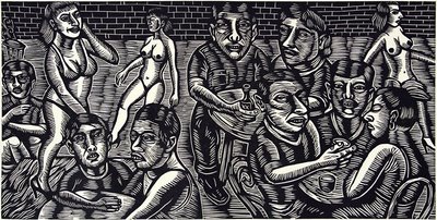
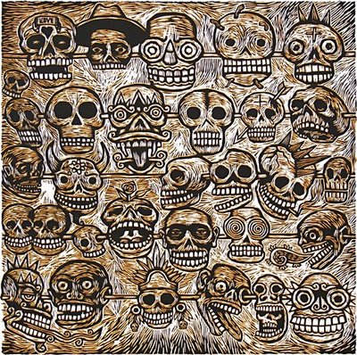
One of my favorite things at the Johnson is their works on paper section which often has current work of emerging artists. That's where the real jolt comes beside the wonderful video installations that they sometimes have. The is the stuff that you can just gulp down without rhyme or reason, without history or sociology,just imbibe and integrate. There were quite a few thoughtful images from big linoleum cuts (36"x 48") to digital output with added/glued detail. I am so happy that giclees were happily at home with these other print media as, for me, it justifies it as a fine media/ fine image making approach. My favorite image was a black and white ink drawing from Laylah Ali "...the exhibition will include a recent ink drawing by Buffalo native Laylah Ali, part of her ongoing Typology series, in which she examines the many ways identity is manifested while referencing issues of race, class, gender, and power." I first saw Ali's work at Art Basel Miami last year and flipped. Her imagery is strong, her messages extrodinary and her decorative approach speaks to this novice. Need to learn more about this fine artist. PBS did a documentary (and their usual great job of writing bios/ getting sidebar information) on her as part of their Art 21 series.

Its snow raining. Everyone is working on their own thing from eating and movie watching to planning for the week. I am predictably blogging by the stove (on minime) with hope to whale a bit more on my paper and get back to some drawings...We need to get back to Tburg from the grey lake to pack Rob, do laundry and unload the pile of leftovers we will chug through this week to K and A's disappointment. Turkey may not look so good after three days! I am roasting turkey carcasses with a chop of celery, carrots, onions and a few soft turnips which smells pretty great and then will boil with water to make a very nice rich stock. The roasting is key.

More later. Maybe a picture?

Inky Lips Press

About Inky Lips Press

A Texas original, Inky Lips Letterpress is owned and operated by Casey McGarr; steeped in design and love for the smell of ink and the sound of a flatbed letterpress turning over and over. No other press in the Dallas area offers what Inky Lips Press can which is original work hand-carved and cranked out on flatbed letterpresses and spun on the Windmill. Inky Lips Press has been working hard at creating invitations, announcements and posters, but welcome any projects that will keep the dust off the type and the press in motion.

These guys run beautiful split font work. They will carve original lino blocks and they are some of the guys that do printing for the fabulous Hatch Show Prints. Check em out if you are wanting to do something letterpress and funky. Seems they have a handle on that.Hatch Show Print Book at Amazon>>
Blurbism has pictures of Hatch that send shivers down my spine>>

Obey Shepard Fairey: Stellar Propogandist


Studio Number One
3780 Wilshire Blvd. Suite 210
Los Angeles, CA 90010
http://www.studionumber-one.com

Studio Number One (SNO) was founded on the belief that art does not just belong in museums and galleries, it should also be an integral part of the visual landscape. SNO creates bold, graphic media that stands out amid the urban clutter, beautifying the environment while stimulating the public with innovative design solutions.

ART DIRECTION
BOOK DESIGN
BRAND DEVELOPMENT
EDITORIAL
ENVIRONMENTAL
FASHION
IDENTITY
ILLUSTRATION
INTERACTIVE
PACKAGING

POSTERS

Guess who this is? Shepard Fairey! In my quest to wrap my head around what he is about--with the prompt from the Obey line of clothing (how is that managed? how does he justify (or does he need to? the porting of his art images to teeshirts and hoodies? Is it another licensing deal like Ed Hardy?).. His work in the stores reflect his print work with new shapes (probably not Fairey) but using his posters to promote his image and personal brand (framed in the store). In the hopping around, I found this critique of Fairey's work by Mark Vallen (sounds a bit like jealousy) which is interesting in his messaging...so if that is the case--now the plagarist is being plagarized by Obey the Purebreed etc.

There is nothing new about using old images as reference. Perhaps Shepard Fairey is a little close in with regard to how he uses those images, but somehow I think this helps in keeping his work as concentrated and good as it is. He could afford to tweak it a little further than he does (particularly in the nuclear image) in the layout--but overall, Fairey is taking the old image to a new place of his own propaganda.

I don't care what Vallen says. I think Fairey is a genius--repurposing images into other markets and using the funds and fame he garners into new arenas and ventures. This is a guy that is really carving out a broad swathe --from guerrilla art to art shows, to a design firm, a clothing line to promoting (and is funding/engaging) Swindle magazine to establishing a new gallery/exhibition space called Subliminal Projects, in the same space as Studio Number One. Subliminal Projects' Mission is stated:

"Subliminal Projects was created by artists Shepard Fairey and Blaze Blouin in 1995 as an artist collective, using skateboards as a fine art medium. By expanding beyond skateboards and apparel to include fine art prints, the group began drawing the attention of Aaron Rose, curator of Alleged Gallery in Ney York. As a result, Subliminal is one of the key groups responsible for cementing the relationship between the skateboard culture with the fine art world, working with the then-unknown artists such as Phil Frost, Thomas Campbell, Mike Mills, Dave Aaron, Shelter Serra and Mark Gonzales. By reintroducing Subliminal Projects to the current art scene, Shepard and Amanda Fairey continue to promote collaborations in the form of publications, art shows and events between artists of varying disciplines."

Look for his skateboards. They are great. I love the portraits and the vector-y swatches and flourishes. They are regal and very offical looking--with images of these guys with their baseball caps put on backwards. I initially thought they were dead gang members until I read who they were. There is that aura around them.

Juxtapoz has a great article on Fairey in their November 2007 issue.
Also, there are his books:
Obey: Supply & Demand: The Art of Shepard Fairey
E Pluribus Venom (pre-order)

In the Spirit of Iowa

Just a quick fyi:

Did you know that the New Yorker and Steve Brodner are doing some original work having to do with the election and the candidates? Brodner, author of Freedom Friesand tremendous political illustrator with The New Yorker, is in several short films on various political candidates with Brodner working on a white board and eraser peppering his illustration with political patter and his views. It is very light and clever--and highlights Steve Brodner's intelligence and historical knowledge of the insane political world. I respect Steve's annual blog entrys on Drawger as he manages to be pointed and yet not shrill or sharp. He is dead on.

Steve Brodner's Naked Campaign>>

Take a look.

©Murakami at the Geffen at MOCA


©Murakama
October 29,2007- February 11.2008
The Geffen Contemporary at MOCA

Takashi Murakami's show at MOCA is more than a show. It's a candy colored trip into the changing mind of a manga/anime inspired artist who is evolving his brand and art from a sexual anime form to that to me, that is more interesting--a fusion of pop art, the branding culture, eastern philosophy and imagery with that of japanese cuteness and palette. Sometimes its over the top cute, sometimes its headspinning "out there" which the context of the entire body of work grounds and to some degree begins to explain and provide the sources for the changes in the art. I mean, there are these painting that look like sticks of gum with random eyeballs and teeth that are arranged very much in the austere and precise world of Josef Muller Brockman, the swiss poster designer and proponent of the Swiss graphic design education of the seventies and eighties. Brockman would be on a rotisserie over this stuff.

Murakami created the DOB character to express himself and act as a personal brand. DOB was his first image and brand--a brand that is used exclusively, and manipulated by size color and placement. DOB was best expressed in Murakama's blow up (huge) DOB heads and these almost Mickey Mouse type paintings that had a roughness-- a painted tie dyed quality that took it off his normal "Superflat" painting technique that defies the hand and could be screen printed or even better, cut vinyl. DOB evolved to Kaikai + Kiki (adorable little Mutt and Jeff characters who are rendered either front on or just their heads--in shades of hot pink and white). I first saw Kaikai and Kiki at Art Basel Miami at a Gallery--they were full sized fiberglass, painted figures--that were striking and funny. However, it was not knowing the context of the pieces that just made them a cute oddity like the trike D'zine did. They are, however, part of a much bigger idea. DOB was best expressed in Murakama's blow up (huge) DOB heads and these almost Mickey Mouse type paintings that had a roughness-- a painted tie dyed quality that took it off his normal "Superflat" painting technique that defies the hand and could be screen printed or even better, cut vinyl. His evolution to room sized, enormous, complex forms expressing both the anime, lessons from DOB and a new component, eastern religion and religious iconography. His Oval Buddha, 2007 has a duality of personality of his main character sitting atop a turtle complete with lotus details and leaves as part of the design. There are tiny figures plunging into and out of the head with a janus like quality--one face at rest, the other with it's mouth wide open with thousands of big conical teeth, layer upon layer of them much like a shark. As I toured around this figure (well over 5 meters tall according to Murakami in his Moca video)--more and more of the detail sunk in...This is an object and yes, an entire show well worth seeing for the first time to just settle into the aesthetic. Beyond that, I would visit at least two more times just to dig into the detail. If I were a starting artist, this show would change my palette and perspective on my art. It is noteworthy.

Beyond that, Murakami is also clever. His work is sold through his own venue--books, teeshirts, buttons, and plastic characters. Inexpensive stuff he marks up to the max. His work originally sold a trinkets sold with gum. Clever man--learning the non magic of how that happens. Beyond that, he has taken it way beyond the world of Kid Robot and into the collections of sincere art collectors. He took the Louis Vuitton pattern and monkeyed with the color and started tweaking it with his eye shapes, with happy cherries and a variety of his little visual icons. Marc Jacobs saw the work and now Louis Vuilton and Murakami are collaborating on some very expensive but very cute (say Asian cute!) bags and accessories. My favorite is a steamer trunk built with shelves and on those shelves are dozens of the same bag with the accent color changing...so essentially , it is a different (but the same) bag for every day of the month. Can you say KaChing?

I am inspired by this man, his work and will be curious to see how it evolves in the next decade as the money has been made, there are new works in film (the KaiKai + Kiki was at MOCA along with the new video done with Kayne West) and his visuals are expanding to take it to a more cerebral while pop inspired place.

Take a look at Murakami's films on the MOCA site to better understand the work and artist>>