Time flies when you are having fun?

Working away on holiday antics and fun…as you can see. We are maxed out with work, lots from all corners of Central New York along with further reaches of New Jersey and beyond. I am personally making piles of holiday presents and getting ready for a wrapathon this weekend…so as to be able to move towards November with an end in sight for the rush on December. I really need to have the holidays all figured out by November 11 so as to roll into Thanksgiving and the month of December without late nights and any more significant nail biting than normal.

I’ve got approval work. I’ve got consulting stuff. I have a laborador retriever to draw. And then it dawned on me that I have a ton of other illustration and illustration related work in the near offing: The Hangar Posters; The Taughannock Triathlon Graphic, and then there is the bakery and the mill. Yipes. I guess that quiet weekend has just got loaded up. Plus, lets not forget the applications for SOI NYC and SOI West shows due at the end of the month.

I roasted two packs of chicken backs this morning and put them in the brand new magic tool, the pressure cooker, along with carrots, onions and celery and let er rip for about 12 minutes. Amazing. Absolutely amazing. First off, I didn’t kill myself (I live in fear the the top of the presto will blow off and I will live the rest of my life with a metal mask because of the damage inflicted). Second, the pressure gauges and outlets worked perfectly. Third, I was able to get the top on (like a pro) versus the bungling the last two times. Fourth, it worked….and I have amazing stock in seconds compared to the slow cooking all day thing. Do you think Rob might be upset if I took the pressure cooker on a mini honeymoon? I might have to marry it.

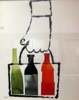
I am plugging away on my little sketchbook project for The Sketchbook Project. The current thrill is that I am working in sharpies…no blacks allowed…and am doing 3-4 illustrations a day to sock in the book. So, I should clock down this sketchbook in no time. I am going to design a cover (wraparound on the epson) with a ribbon with little bees sewn on to dress up the now grungy brown cover. Dig this:

“For the first time ever, we’re adding notifications for each sketchbook. As the artist, you’ll be able to receive e-mail or text message notifications each and every time your book is checked out to be read! We do our best to make sure every sketchbook gets a little love, but we can’t promise anything about how many times it will be checked out. We’re not responsible for dropped texts, e-mail notifications that get sorted to the junk folder, or the costs associated with receiving text messages. We’ve got enough responsibility with all these sketchbooks to catalog!The books will be included in an exhibition that tours Brookly, Austin, San Francisco, Portland ME, Atlanta, Chicago, Washington DC, Winter Park FL. So, its trackable and we will be ab le to see who sees the work and if there is any response. Its a nice little creative sidebar that is keeping me interested and frankly, thinking a bit more…randomly…but a bit more.

Its a lovely afternoon. I will go to the bank and get home for more work. There is hope we will be going to the Pourhouse tonight to see the Grady Girls. Should be fun. Need to get all the paperwork complete for Alex to ski with ski club this winter. Am working on figuring out how to get Kitty from Amherst to Ithaca for Thanksgiving and Xmas….a bit of a path…but not insurmountable.

Sagamore: Day One

We had a great visit with Kitty over the weekend. Saturday, we met her on campus and went to pick up some of the computer stuff we are having repaired in Amherst (great resources at a great prices that we do not have in Ithaca). Then we took her and a friend to the Korean Restaurant to have dinner and catch up.

She is in fine feather—all is right with the world. We are delighted as she has settled and is herself again. Not fretful and finicky (the pronouncement day one that she will need to change dorms) has dissolved and she is loving every minute of work and play that is being handed her way. Surprisingly, her favorite course is the Indian Epic course (The Ramayana) with the Penguin book translator (abridged) as her professor. She cannot get enough of it…and she is reading and recounting, talking about mythology and culture…alll those things that makes me crazy with glee. I love the stories but even more, I love the nutty pictures that depict all this Indian Superhero on steroids type of content. It will be interesting when Kitty gets around to thinking across topics from Indian Epics to animation. This is when the real fire will engage. She was quite pointed about ideas and points of view she has developed over the years on the topic of art which really lights her fire…and she will take no prisoners when it comes to that. So our girl with no opinions might have a few of her own. It is wonderful to see our girl blooming in this new culture of growth, learning, talking, trying. I know its premature, but it feels like great things might happen out of this experience. You all know that I certainly hope it does…but it really has energy behind it.

Yesterday, before our trip, we had breakfast with Kit at Atkins Farms, the wonderful grocery store just across the cornfield from Hampshire College.  They have a great breakfast, plus we get a chance to poke around the store and buy great stuff we cannot get at home…so a gigantic bottle of maple syrup on special, some bee capsules (magic feelgood energy etc…I believe!), some gourmet pancake mix for competitive discussion on a project, and a brine for pork and/or turkeys that came in a really nice, basic foil pillow pouch (two color label on matte silver).  It was nice sitting outside and watching Kitty talk and update us on the wheres and whatfors of her friends and life while watching something go on that we do not have in Central NY (and seems to be a waaaay easy way to fundraise).

Fee: $15. to get a pair of used pants, old shirt and all the hay you can stuff into it. There were hats (fromWilliamsburg Snack Shack, Q. Cassetti, 2010 Oriental Trading Company or the like) for the scarecrow’s head. No huge skills out there for the making and stuffing of these hay beings. And little and big around here cannot get enough of this entertainment. The local fire departments (as posted at the Williamsburg Snack Shack) even get into this holiday offering fun. Lunch was good at the Snack shack. So, this sort of selling seasonal fun hasnt crept into Central New York. People were tying corn sheaves onto their roofracks yesterday along with the odd carrying of these haymen under calm daddies’ arms…limply wiggling, deadweight figures that were a bit eerie in  their likeness….but well worth considering to do in our Tburg Farmers’ Market space.

We visited The National Yiddish Book Center at Hampshire. The Book Center is remarkable from the moment you park in front of the asian inspired facility, framed by beautiful gardens with meaning with comfortable places to park yourself with in the sunshine or in the soft pine woods with adirondack green chairs in a circle around a generous table. There is a pond and an orchard with a garden devoted to Yiddish literature and writers. There are performance spaces that we saw peering in through the windows. Combined with the Eric Carle Museum, the book world, illustration, imagery, photography, storytelling all hugs our little Hampshire giving the students an amazing source for their own work, their own stories, their own images and illustrations.

Sagamore Rooftops from our room, Q. Cassetti, 2010We drove across Massachusetts and up 87(?) to poke into the Adirondacks at Exit 23. It was a beautiful blue green drive with golden light and trees beginning to turn. There were ski gondolas as lawn ornaments the minute we turned off. The drive was inspired into and up the mountains to arrive at Sagamore just in time for dinner, a gathering of all the interesting people on the Museumwise board and then cold, cold sleep.

Today has given us blue skies and a cool day. I am surrounded by historians, curators, conservators, preservationists, organizers and planners. It is a most wonderful group of active minds, passionate about their topics, their work, their learning, this group. There is such vibrancy that there are glimmers of the travel with Hartford and Syracuse. I have needed some time to think and reflect. As much as I have brought project work to do, which I will do, it is nice to have an expanse of time to think, to do, to draw. Tonight there is a “meet up” at the Adirondack Museum (which I love)—and more ideas and interesting people.

One more thing>> take a look at this>> the Eye Fi>> too cool for school.

birds

Pattern, Alexander GirardThis is Alexander Girard. Love this pattern. Feels Matisse-y, but cut papery, and also the sixties/ pop/ Herman Miller rules the universe as well. Love the way the counters work with the forms, where the pattern of one is overlaid on the other and vice versa. The palette is not totally corporate crayon box, but the greyed out greens, blues and warm greys really make it along with the ballet pink which sort of quiets the magenta down. Hot and brights against greyed and quiet. Really works in a nice way. I need to learn about this. And, it is not blocked out in squares, but more free range/ organic grid versus the crap I have been doing that is all gridded out. Forget that. Need to work on this…maybe in the tradition of CF Payne, just see what they are doing by beginning to copy this to really understand what is going on.

I got up early this morning to take Alexander to his running practice. We all had an early night of it at the Luckystone after a late dinner thanks to you know who not getting her stuff in gear. Albeit, I made a really great tomato tart (from M Stewarts little pocket cooking magazine) and we had corn from the stand which was extrordinary. The produce, as an aside has been amazing this summer. Plump, sweet and robust. And with this thinking, I took myself to SilverQueen (you pick) after dropping A. off in the middle of the Hector National Forest to pick something (I was hoping peaches). Instead, I picked raspberries. Yellow gold ones and red ones. They were as big as wild strawberries…and in the cool morning with the bumblebees working diligently at their tasks, the quiet drone of the work and getting lost in my thoughts really was quite meditative and wonderful along with picking a big bucket of berries to mascerate and freeze for colder times. What a gift. And what a time to think and collect my thoughts. There is so much going on, it was good to let the ideas mascerate themselves, and see what could bubble up that was interesting and actionable from not focusing but randomly letting the ideas float and flitter like the buzzing bees.

Was back on the Fraktur and Conrad Beissel reading last night. Was re-reading about the identification of David Kulp, the Brown Leaf Artist, a known (and newly identified Fratktur artist and itinerant schoolteacher and scribe). I adore Kulp as I love his use of color, his calligraphic vines and florals, his confident use of the brush/pen, and his naive angels and figures that charm me to no end. Kulp was finally identified by a book he penned that was found in the bottom of some ordinary German texts. This book Kulp wrote/illustrated has his teaching book, his tools to illustrate concepts to his students, along with tables, notes, lists all in his handwriting which matched the script of the Brown Leaf Artist. The Mennonite Heritage Center speaks about this type of teacher/scrivener this way:

Bookplate (Bücherzeichen) for Barbara Meyer, David Kulp, 1805, Philadelphia Free LibraryThe colonial schoolmaster, Christopher Dock, introduced to the Eastern Pennsylvania Mennonite community a folk art form known today as fraktur.  Earlier known as fraktur schriften (literally broken, or fractured writing), this was a type of decorated or illuminated religious writing which has origins in the monasteries of medieval Europe.  Dock taught at the meetinghouse schools of the Skippack and Salford Mennonites during the 18th century. 

Other schoolmasters who followed Christopher Dock and continued the fraktur tradition in Mennonite schools in Montgomery County include Huppert and Christian Cassel, Henrich Brachtheiser, Andreas Kolb, Jacob Gottschall, Jacob Hummel, Isaac Z. Hunsicker, Martin & Samuel Gottschall, and Henry G. Johnson.  Bucks County schoolmasters whose work has been identified include Johannes Meyer, John Adam Eyer, Samuel Meyer, David Kulp, Rudolph Landes, Jacob Oberholtzer, and Jacob Gross.

The use of fraktur schriften played a significant role in the educational process.  A writing example, called a vorschrift, was used to teach the students to write the alphabet and numbers, and to learn hymns and scriptures.  The texts on the vorschriften encouraged and admonished the children to fear God, lead pious and obedient lives.

The schoolmaster also drew colorful birds and exquisite flowers on small slips of paper, which he gave to industrious children. He decorated bookplates for handmade hymn-tune notebooks.  Later, in the first half of the nineteenth century, schoolmasters created many delicate bookplates for printed hymnals, Testaments and other devotional books.

Fraktur writing flourished in this community from approximately 1750 to 1845.  The reluctant acceptance by the German-speaking Townships of the state sponsored public school system in the 1840s brought the decline of fraktur writing in the schools.  These vibrant treasures were cherished by the children, safeguarded in family Bibles, and passed from one generation to the next.

Isn’t it remarkable that futher I get away from Fraktur and Folk art, the closer I am to getting back to it again? I marvel at the work of Alexander Girard and David Kulp. Same sensibility, same vision just different eras, different times. Am I throwback too? or a continuation of the same song, just a different place and time. Or, is this somehow a creative wormhole? Love that idea. A creative wormhole where something that happens in one place can be happening in another place in another time.

The Internet Encylopedia of Science tells us (dumbed down for artists!):

A hypothetical “tunnel” connecting two different points in spacetime in such a way that a trip through the wormhole could take much less time than a journey between the same starting and ending points in normal space. The ends of a wormhole could, in theory, be intra-universe (i.e. both exist in the same universe) or inter-universe (exist in different universes, and thus serve as a connecting passage between the two).

Must go. Hometeam is here.

forward

Angel 2, Q. Cassetti, 2010, digitalIt’s soft pencil city here. Normally, you can see me with a pen in my hand. No questions, no changes…that is, after I work the original idea in blue pencil. Today, its  Caran D’ache Pablo pencil in black. Sharpened within an inch of its life…to make hard line drawings to make my “red headed stepchild” pictures…trying to the exemplary Alexander Girard.  Interestingly, looking at the Girard work, I have been surprised that his body of illustration work is not too deep/broad so it leaves a lot of space for me to continue with his spirit and fuse it with Q.

I did just find a bunch of stuff that Girard did..applied to bicycles. He did a fun butterfly/butterfly pattern that maybe could be applied to bees…Also, he did a tree of life that was on a bicycle here>So, I am not really too off point with content. Maybe I need to do a tree of life in this spirit. The folk spirit, the whimsey are in these pieces. I am going to go with this for a while and see where it goes. I am finding my advent calendar work to be a good starting place for this new Girard inspired grouping of work.

I am planning to drive down to Ithaca this a.m to get my new specs. Just slightly blinder…but looking forward to a bit more sharpness in my life. I will keep my short glasses for the computer, but migrate to split lenses for the long vision. I also have my new toy glasses on order and coming this way (striped frames and a pair of metal frames). Argyle frames in the sights (zennioptical.com).

Holiday cards await as does a publication. Worked on some work for a very politically inspired friend yesterday. I am liking where it is going…and hope that I can be of help to him, his message and agenda.

more later.

Wooden Head

Rapunzel, Kay Nielsen, from www.artpassions.net"…It was now three mornings since they had left their father’s house. They began to walk again, but they always came deeper into the forest, and if help did not come soon, they must die of hunger and weariness. When it was mid-day, they saw a beautiful snow-white bird sitting on a bough, which sang so delightfully that they stood still and listened to it. And when its song was over, it spread its wings and flew away before them, and they followed it until they reached a little house, on the roof of which it alighted; and when they approached the little house they saw that it was built of bread and covered with cakes, but that the windows were of clear sugar. “We will set to work on that,” said Hansel, “and have a good meal. I will eat a bit of the roof, and you Gretel, can eat some of the window, it will taste sweet.” Hansel reached up above, and broke off a little of the roof to try how it tasted, and Gretel leant against the window and nibbled at the panes.

From Grimm’s Hansel and Gretel

More on Kay Nielsen and his Hansel and Gretel (1925). I was cruising around and found that I could download a pdf (for free from Logos Books in their Public Domain Hour offering). There are really nice plates and offerings from Art Passions to explore Nielsens color and extrordinary black and white line work. Wow. Gives this gal a kick in the booty to keep going, keep going, keep going. Love how patterned this Rapunzel image is...a veritable tapestry of pattern, tone and imagery. Nielsen really partied with his work.  He just keeps embellishing and designing with the black and white, white and black. And he uses color to pop the story out of his work. Nielsen's work portrays a man who leapt out of bed every morning to grab his brush and live in his work and world of decorative illustration. What joy. What happiness.

To think that he died in poverty is amazing. His influence through his fresh and exhuberant work continues today.

Wikipedia on Kay Nielsen>>

Elizabeth Nesbitt Room, University of Pittsburgh, The Illustrators Project: Kay Nielsen (1886-1957)>>

Golden Age Comic Book Stories>>

Childscapes.com>> Nielsen books for purchase>>

The Leominster Galleries>>

Today its packing and wrapping things up for our field trip to Amherst tomorrow. Alex has dinner to take to an indoor track meet potluck. We have a small present to put together for Kitty's hostess. Money for Alex for his student United Nations trip Friday/Saturday. So lots of mom work along with the general work for clients. Busy but not painfully so.

Have been interested in a job that keeps coming back and forth to redesign an iPhone app that a group in Canada is putting together. So many of the developers present themselves as the whole shooting match from architecture to creative to coding to implementation. They miss the creative bit. So, I get that as a bit of an offline/ ping pong way of driving consistency. What is growing out of this (as this is the second one we have touched for the same client) is a corporate standard, a consistent palette and type treatment, and a vocabulary for handling lists/charts/ graphics. But it's zero to sixty and then wait, then zero to sixty and then wait. But its making me think which is rare for this wooden head.

Got some creative work done on GlassLab for the Museum along with a "brand" for the up and coming Medieval Show at the Museum of Glass.

More later>>


Candy House

Kay Nielsen, Hansel and Gretel, from www.nocloo.comI am reading a bit about Hansel and Gretel. Not a happy tale. There are two iterations with the first being an outgrowth of a practice during the Middle Ages of leaving a child in the forest because there was not enough for the family to eat. Thus, Hansel and Gretel left by THE MOTHER and the good, reluctant father to perish> finding the house etc. The  other was the sweeter version of mom dropping dead, dad remarrying the STEPMOTHER, who had no interest in the children and insisted her new hubby get rid of them...and so on. The happily ever after is somehow the kids and dad (maybe mom but stepmom drops dead), bringing physical riches (stones, gold, etc) to make a happily ever after for all of them. However, during my cruising around, found  the Kay Nielsen illustration from that tale (shown to the left). Just love Nielsen anyway he comes, but wow. So much Mary Blair in this (really the other way around), and look at the depth of how he pops the color in a warm shell of neurtral trees. He definitely says, look here.  I found this and other great illustrations at Nocloo.

Nocloo.com  describes itself as:

"Well, it's a typo for noclue, someone already took the noclue.com domain before it came to my head that's a good name for my project. It's a project born out of the passion for old children's books that I collect over the last 10 years. I just want to share some these amazing artworks from the great Golden Age illustrators that I love.
Sadly, many of these books are no longer in print; too expensive to acquire or totally unknown for the majority of the younger book readers. The project started as a resource for book collectors like me, but over the past few year, it has evolved into a creative source for artists, students and many others."

They have a lovely collection but have watermarked images that are common property as well as sell prints of the said images which though legal rubs me a bit the wrong way. However, if you are looking for images, its an interesting resource.  I found Nocloo from the ASIFA-Hollywood Animation Archive website. ASIFA Hollywood is a great site for more than just animation and comic strips. They have a lot of good talk about illustration, illustration/animation practice and people etc. Worth the looksee.

Work on lots of design stuff today/tomorrow. Wednesday through Friday in Amherst with Kitty. Should be interesting and hopefully fun. This journey continues albeit in a much sweeter way than in the past. More later>>

Ida Bohatta(1900-1992), children's book illustrator, ViennaPrepping right now. Our guest list has expanded and the humongous pork roast that looked like leftovers for days looks just right. We are now at 15. I baked two layer cakes (from the Ghiradelli cocoa container...fab) and froze one of them. The other I split open and iced this morning manifesting itself as a proud and tall, four layer cake. I put pearly decorations on the top so that is ready. We made ice cream sandwiches with the cookes we got yesterday and used up the remaining chocolate icing to make chocolate oreo type cookies to offer around too. There was a great deal of effort put around cleaning out the fridge--from processing stuff to throwing stuff away. I am making an order of whole wheat twists to use up the bulgur wheat that Rob is so interested in my getting rid of. Rob is busy making the table bigger and finding chairs for tonight. Kitty and Alex are skiing and will be back to the full house they seem to be enjoying.

Last night's entertainment was teaching each other how to whistle through our hands and flip bottle caps to shoot them across the room. Great Hilarity. There was dj'ing by the teens with Alex gracefullly dancing for us. I think that boy has dancing genes like Kitty. Tonight there is cake and all sorts of friends from the older ones to peers. So there should be some fun for everyone.

Ida BohattaI was floating around in my illustration haze yesterday and banged into Ida Bohatta through my search for Erzegebirge stuff to draw.  Turns out, Ida Bohatta figured heavily in the illustrations of my childhood in birthday cards and postcards from Mrs Eddy (my grandmother) and later my mother. They were often images of little fairies with bugs, or gnomes at the holidays and the like. And guess what? She too, is part of this charming German tradition that is part of my personal DNA, my illustration mis en place.  Bohatta was born in 1900 and attended German art schools and then on to the Successionist program. The illustration at the top of the page was completed when she was fourteen years old. That training and rigor did not seem to dampen the spirits of this illustrator whose whimsy and world is equal to the Englishwoman, B. Potter but in a different spirit. I need to go further on this...but just wanted to share this new illustrator. I have a bid on a little book she did for my friend , J Decker, who may be inspired by this illustrator who lives in the same charming forest she does.

Have to go. There is bread to punch down and tables to set.

I got an F


I am getting somewhere with these Stooges....and was thrilled when I posted it to my facebook just to get a reaction that Pablo Lopato (impetus for this new twist) weighed in and said "Nice!". That means, keep going.

Gary Kelley talked about how he developed his books..the thinking, the research, the design that the illustrator engages in the process with the art director having a point of view and placing the type. Very interesting from the standpoint of the designer and from the look of the books...the engagement of the designer. Gary loves the relationship so it works for him. This is a dream situation for Gary as he views it not as the big CaChing! but more that this is another opportunity to do what he loves and develop a complete body of work, essentially, a portfolio to get his work out there. What I love about Gary is that illustration is magic for him. He loves to see the idea bloom into the image from the conception through to the final with every step a juicy morsel to be savored, stressed over and adored. I can so relate to his more art oriented approach--looking for colors and shapes--and allowing measured risks to happen as the color evolves and the design builds off the bones of the sketch. Remarkable and quite inspiring. Gary's two new books, one from Hyperion on Eleanor Roosevelt which pretties her up a bit, but is as compelling visually with the nicely designed images and spreads to the not for little people book on Paganini and his deal with the devil (mirroring his extrodinary book on Robert Johnson done with singular and stunning monoprints). Both worth buying even if its for grown ups.

Gary's vision, his joy in his work, the so called, simple paring down to color and shape is very motivating to me--his artistic ambition to constantly be amused, charmed, inspired, driven by the work of other artists and have it change and effect his work and direction is a gift upon the closure of this chapter to me. Somehow these last weeks are so poignant and so distilling to make the time fly but at the same time stand still when you hear the truths that are being imparted.

C F Payne loves what he does from the abstracting and stretching of the head to the making/doing of his work--but it is somehow less spiritual and brawnier than that of Gary Kelley. Chris is working on a "celebrity" book with Steve Martin--and it seems to be a happy marriage (we hope for this). Everyone worked on their own projects from portraits in either pastel and/or the multiplexed C Payne technique or on thesis work or in my case-- doing some intellectual stretching trying to simplify and abstract heads.

I had my thesis review today. It was Murray Tinkelman, Doug Andersen, Bill Thompson and to my delight, Bunny Carter. They wanted me to recount a bit of what the paper speaks to--and then to talk about my time at Hartford. Bunny was very nice and very positive about the work, where it could go and that the thing I will need to worry about/focus on are more bodies of work like this or like Memento Mori that will drive the style. Murray projected that in the right time (like the sixties) I would have been asked to join the Pushpin Studio (wow...!). Bunny projected that this work was going to get out there--and get published--and that the thing I will need to worry about when I have imitators, was to keep in front of it. Wow. Imagine. Do you think? And, she also said that she was proud of me as a women doing this...and from a goddess of illustration history and a keen observer of people, I am tearing up from that. Now, I just have to dog it to see where we go.

So, I have the F.
The Terminus F. I want to hug the world, hug myself and cry a little bit.

Wintery thoughts


My glasses are found at the grocery store. I finally was able to get into the College Board website and finally, finally registered K for a specialty SAT in French for January. Made the amazing cake Hazelnut/chocolate torte (made with pecans though...and it totally works) last night, iced it this morning. Made a half a flap hat...and tried it on (while it was still on the needles) and found that it might fit an ogre and not a normal person or teenager. So, I ripped it out to the earflaps and have it back to where it was, 2.5" less wide overall. These hats are crankable (created the pattern from a hat A. has) with nicer finish work...maybe tassels?

K was over at her friends, the identical triplets house for the snow in and then overnight. It was very fun for her as the stove of the house had a "sabbath" mode for folks to set so as not to allow them to cook over the sabbath. Apparently, someone had set the stove for sabbath, so there was no cooking until they could get a hold of a customer service person who happened to be snowed in (like most of the poeple I called yesterday). So, they cranked up the woodstove and cooked and heated on the stove. Then off to the fields with the dogs and their imaginations where they made up ideas and talked about them as a group (these are high school seniors and juniors, mind you!). Then back to the house for pyjamas and chick flicks. This morning, when R went to pick K up, there was the beaming (he always shines...its just his glowy personality) dad, with a two man sleigh (rough and ready...a working sleigh) hitched up to a very shaggy caramel horse with bells. No, not colonial Williamsburg, not a Christmas Card, just more farm tools with tremendous style. Just hearing this made my day. It was a Jan Brett moment. The Jan Brett books are so holiday with their tales and pictures of trolls in trouble, or Norwiegan imps and christmas makers with twined branches and porcupines, red wrapping paper and ribbons, handmade presents like mittens and hats--she inspires the best of the holidays (I love her books...sometimes her drawing can be a tad rocky...but cant it be for all of us!). I googled Brett to find out a lot about her inspiration and ideas for books--but on a personal note Scholastic tells us:

"When I was I child, I decided to be an illustrator. I spent many hours reading and drawing. I remember the special quiet of rainy days, when I felt that I could enter the pages of beautiful picture books. Now I try to re-create that feeling of believing that the imaginary place I'm drawing really exists. The detail in my work helps to convince me, and I hope others as well, that such places might be real.

As a student at the Museum School in Boston, I spent hours in the Museum of Fine Arts. It was overwhelming to see room-size landscapes and towering stone sculptures, and then moments later to refocus on delicately embroidered kimonos and ancient porcelain. I'm delighted and surprised when fragments of these beautiful images come back to me in my painting.

Illustrating children's books always seems like a big adventure because as an artist I must explore and give thought to my subject — an artist needs to know everything about their subject. I try to get a feel for the country and times my characters live in, and I get many ideas from traveling to different countries, where I research the architecture and costumes that appear in my work. After a trip to Norway, I was inspired to write three books! I've found that the details and the odd little things one notices help make a story convincing. In my mind, the story comes alive. And for me, the best part about telling a story is drawing the pictures.

Jan Brett lives in a seacoast town in Massachusetts with her husband, who is a member of the Boston Symphony Orchestra, and Buffy, her pet hedgehog. To find out more about Jan Brett, visit her Web site. Meet some of her charming characters, and enjoy all her wonderful online and offline activities."

and the snow continues to fall.

R. just came back with my specs and a Christmas tree for his parents (who live with us in an apartment within the house). They are entertaining and being entertained during the holiday, so it just seemed like the right thing to do. R. is busy thinking about design ideas to move the rennovation further next summer with this house which should be great... and we huddle next to the cricket (our tiny log wood Jotul stove previously mentioned Feb 2008). That little baby can crank some btus and with the rooms of this big house (the one's not closed for the winter) it can be a bit breezy that layers and hats are def in order. I even have fingerless gloves (very stylish) that I have made to help keep in the heat.

Must go clean off the dining room table (from last week's deluge) and prep for the prepping of the suitcases.

More later.

on fire


They shouldn't have let me get on the bus. Absolutely shouldn't. They should have kept me locked in the car with my black dog, with both our noses up against the window, waiting for the good people to come back and drive us around and then back to our house and the room where we work, the room we eat in and the room we sleep in. But they were not so smart.

So, I got on the bus to New York with team Hartford. And now, a week later, I cannot breathe. I am on fire. First off, I am loving my little doodles at breakfast in watercolor. The sheer loveliness of the paint, how it blends--how opaque I can get it, how thin I can get it. Right now, I am working on a dumb little picture of pretzels, swirls of mustard, hearts and mossy green dots (sounds like a wrapping paper for either Germans or beer drinkers or both) just to try out different colors in these new Maimeri Blu paints (which are as advertised, extrodinary...pigment in a pan format)--just need to get a tube of white gouache to complete the bill. I am loving them so much, they may just go to Miami for the fun of it. I could do these doodles all day long. Instead, I write and try to keep my head down and get the work done as these tempting diversions beckon. I am loving my ladies with butterflies. They need to be taken to the next level. I need to do at least eight more for the body of work. I need to print them out and color them/tint them per My Mentor's suggestion (which I try to try). Then, just out of the blue, I decided to work on K's portrait which I have been posting the progress. I am loving what is happening, the color, the look and feel, the graphic quality and simplicity. I am aiming for three (at least) by San francisco...and then there will be a mini body of work to look at. Really have a chance to flex my muscles.

Work awaits. The day has been short and everyone has been having fire drills with the emergency jobs. Urg.

Multitaskability


Its that time of the year, the day before the day before a holiday. Always that moment, that day when the corporate world explodes/implodes and we are there with open phone lines, sharp pencils and multitaskability to help them all to get out of the office for their breaks which sometimes manifests itself in my not having a very happy holiday (read working). We are holding steady. Eleventh hour, we need to see this, then, now...and then...A bit of hair ripping. But, I am typing this while the postscript files are saved out.

Had a mind bending conversation (all positive) with mentor Murray. He got on the phone and had all sorts of ideas, input and excitement around the image that was posted last Friday ("IF: [Homer's] Opinion).He was so encouraging, so positive, so delighted with this piece--suggesting I get paints out and tint output on watercolor paper. It was such a blast of postivity, my hair hasn't flattened out yet...and I am a bit stunned...trying to get some time tomorrow to output the image and play with color a bit..He wants a bit more of this...and I have been working on the Genesis stuff with a whale that is moving someplace...so it sounds like parallel universes with genesis and fluffy ladies. I have the genesis corrections from NYC (eliminating the goofy white lines that separate the tree from the background, the owl from the background and shifting the background color) and now I need to go here too. No problem. Every step Murray pulls me forward--and the work improves and I keep learning. I keep taking in the conventions as I look and listen to this wonderful educator, kind man and incisive art director and guide. My hubbie is pretty good at this too. But I fight R. I am not allowed to fight Murray (I have almost given up--what will he do?) and each and every thing has value to me. I suggested Dennis Nolan's palette and he suggested John Alcorn's palette. So, Alcorn it is. We will see what happens.

I have been looking at Leo and Diane Dillon's Bradley, Will Bradley, William Morris and Walter Crane. There are some other conventions that come out about illustrating--the ones Murray has pointed up are, to refresh myself:

> women have light and delicate features. minimize or eliminate shadows.
> women have light mouths--do not draw the bottom lip, but suggest it with the shadow under the lip.
> all elements that move away from a trunk or a torso taper (read, arms/legs or branches or octopus tentacles even flower stems...its a good one)
> new understandings:
--sometimes women have tiny, bitsy hands and feet.
--sometimes the figures are almost graphic shapes with the background and foliage doing all the business with the detail insanity. The sheer relief of the plain figure is remarkable and becomes the first thing the eye sees.
--edit while you draw. More is less.
--keep the pen moving and if you worry, photoshop also can erase and edit..
--think dark and light with the page patterning with figures and foliage.
--faces are always almost calligraphic in simplicity. No need to whale on it. Brief for male faces, scanty with women.

Gotta go. Some postscript files are crying.

Know Exhibition


"Know" featured at this year's Gen Art Vanguard Fair is going to happen real soon. Mark Murphy, Murphy Fine Art Editions is working hard to post information prior to the show dates of December 4th through the 7th. Syracuse Alumni, Don Kilpatrick is one of the artists in this show. To find out more, here it is from Mark Murphy's Scribble 08 Blog>>

> Image is Don Kilpatrick's entry for the Know show.

Stocking up


Leo and Diane Dillon

Well, thanks to Joe Ciardello and others, I ordered up a stack of Arches 140 Hot Press and a fist of tubes of watercolor (per the palette recommended by the ever amazing painter, Dennis Nolan). I was stunned and drooling after I had a chance to hold Ciardello's beautiful illustrations--with the paper being luscious and had great hand...a great surface that takes the ink. I also loved his hand ripped/deckled edges that I think could be part of my illustration... taking the hand drawn thing further making it toothier. I had to get some...no choice. I also got some watercolor frisket as well as I adore the little graphic characters that the Dillons use...and the graphic illustration from the Illustration House (at left) that really got me charged up to try this approach. I love the simplicity and whimsey of this image and how all the parts are really working. Breathlessly inspiring.

Doug Andersen nipped at my heels suggesting scratchboard and watercolors, hand tinting prints etc and you know, I am going to take the challenge along with scratchboard (and a technique that Chad Grohman is going to explain to me having to do with a fake woodcut approach). I also dialed up a holiday card with various inserts for this year versus stacks of prints for everyone. Probably prints for clients...but not the entire list as the supplies are not cheap and I want to say hi to a lot of people. So, the list gets parsed--the Hi list and the print/gift list. More letters the better...but with a little thinking around them. Plus, the postage is pricy on the big prints...so change is in order. And, appropriate too given the state of the state of the state.

Speaking of inspiring--this image is a knockout from the Dillons. I love how Will Bradley it is...the line work, the sheer texture of the plants below (along with the demon who is hidden), and then the simple figures who draw your eye. I am very taken with this, the color, the composition, and the linear forest (remember this Q.) used to build the image and set an environment for the story. Lots to see here.

Rob was so kind while we were in Fort Lauderdale, pulling off the street and allowing me to scramble around the car to take snapshots of the wonderful plants and palms that spring up in every patch of dirt in front of everything. So, I have great resources along with my new used books from Alibris on Indian Painting. Am getting charged up again.

Gotta go, work awaits.

HAS: Day Two: NYC/ Brooklyn


We used hopstop to figure out how to get over to the Pratt Institute neighborhood for a day with Ted and Betsy Lewin and the photographer, Bill Kontzias. We were cycled through in groups of 9--with a walk through Pratt, time with Bill with a brief, very brief overview of shooting images and how it relates to art and illustrations, and time with Ted Lewin and Murray doing a series of quick shots using different lighting with classmates as models (with hats). I was reluctant about this and the travel but it turned out to be a wonderful experience on a perfect fall day with the subway being really nice, clean and nonthreatening these days (and I was thanking my stars with my subway time when we lived here to take the fear away). The Lewins were charming and hospitable, opening their beautiful brownstone to us from their basement aparment for Bill K to present his slides to tromping through their house to the tippy top to Ted's studio for the shoot. Betsy took us to Pratt, which was impressive, beautiful, clean and very happy to see their show at the library and then some little side trips to see sculpture she loves, the Italian Courtyard, and the amazing steam plant (can you say the home of steam punk...very "Brazil" with turbines all shiny and red, all sorts of iluminated dials and meters, a wall of some pretty scary, frankensteiny switches all on two levels with a catwalk above which a stupendous, golden light fixture which sang with praise for electricity and power.


Bill Kontzias, a photographer and teacher at Pratt, took us through the development of the use of the camera from camera obsura to the current camera we use today--showing it's influence in art and evolving into illustration. His insights were wonderful and made many of us sad that he couldn't spend more time with us going through the development of the image, the storytelling, the light. His wisdom and knowledge really resonated with me. I love it that he stated the the Lens does the drawing and the light does the painting of the image. He spoke so briefly about the types of shadows on a face...from the butterfly under the nose to something called a loop light, which was used to great artistry in the Mona Lisa--which shifts the shadow from the butterfly shape off to the left or right, and in so doing, focuses the light on the eyes, softens the cheeks, really adds to drawing the face. He waxed eloquently on how Michelangelo really "got it" relative to lighting and perspective which Konzias linked in many of his examples through to the same concepts with Thomas Eakins rowers and the medical class images. He showed us some pretty mind blowing perspective studies that Eakins did (beyond art...) along with pointing out the contour and edge lighting that took Eakins paintings beyond that of normal photographs. He showed us original Eakins study shots, which in their own rights were modern, elegant and for me, more relaxed and "real" than Eakins beautiful but stiff representations of people. One could live in the space that his photos rendered..but maybe not so much in the painting. Kontzias also cited that a camera is a a tool for photographers and illustrators--and that tool was something that could see beyond that the artist could percieve at the time. Just hearing this took the stigma out from working from and with photography. Its been done since Vermeer...so whats all this about cheating and stuff. What a head job was done on me in school. Once again, its the final picture that matters.

It was fun working with Ted and Murray working with a bouncecard and a single source light with a gel on it. Some examples are posted for fun. We had a nice lunch at a Thai restaurant with all 36 or us broken into tables which the nice staff took in stride as we kind of overwhelmed the place...It was really good, affordable and got us charged to get back on the subway to get back to town. We are sitting here in our room with our feet up...talking away, checking mail and seeing what is up. Some of the group are going to see a show, some to the Society for sketching and the two of us who are happy for a bit of nonteam, quiet time.

More later.

HAS: Day One: NYC

Great speakers at the Society, Steve Brodner and Leo and Diane Dillon. The Society looks terrific under the new direction of an old business associate, Anelle Miller who has cleaned the place up, put flowers and decor in the right place, who transformed the womens room into a nice place versus a bad bar and grill restroom. The place seems spotless, with show graphics, illustrations hung straight, and plumb, and with the staff def chop chop. She has transformed the place and really deserves kudos for the hard work in making the society more of a snappy place (the worn holes in the shredded carpet were gone. Yhe big room we were in was comfortable, big and well suited for our lectures in the morning and the crit in the afternoon.

Steve Brodner was as always, salient, smart and insightful. I throughly enjoyed his insight about the recent events. His work is extrodinary, transcending Thomas Nast--with wit and bite that really communicates not only in his print work but now the new "Naked Campaign" videos he has done with the New Yorker Magazine. What really worked for me was his talking about the idea of creating a niche, your own job and then backing into it. He had decided that he was going to take this approach and it has worked from assignments covering political campaigns, to this new venture with the New Yorker. He is entrepenurial in his work--getting it out through the print and electronic media--thinking and learning as he goes. He also shared his approach to work/teaching:
1. Read for Essence
2. Sketch
3. Form a Sentence > establish his metaphor
--whats my statement
--think about staging hierarchy
4. Composition
5. Finish

Every pictures needs to mean something. "There are no casual notes in Mozart." He also is pretty fluid in his use of media from drawing with a paintbrush to pen and ink, to watercolor and so one. His influenced are mainly Steadmann("angst"), and Hirshfield ("elegance"). Brodner is a thought leader beyond his niche. We are lucky to have him walking this planet.

I am so jazzed by Leo and Diane Dillon. I have always loved their work...but what makes them tick, their philosophy and interplay is amazing. They learned to work together out of their competitive nature. The fought and fought until they came up with a working method where one person would work on a sketch and pass it to the other and back and forth until it is realized. Then a tight pencil needs to happen, then a color comp and then a final. The Dillons have three artists in their family> Leo, Diane and then, the third artist, The Dillons. In taking away the ego, the me--as Leo said "You've given yourself away if your style is yourself". Once they have given that up, the media, the rendering, the sheer pride in the final image and it's pristine quality takes a far more significant role. So, we saw woodcuts, we saw crewel work, stained glass windows, wooden panels, paint on acetate, pastels, airbrush. One image more striking than the next with a surprise for me in the woodcuts (one inspired by Will Bradley that really called to me) and in the new children's book on Jazz (very graphic, referencing Tom Purvis to some degree, Milton Avery etc.)that pushes me to try more graphic things too. I know I can do this, I have just held off going there. They also had a body of work centered around crythosethia..making objects up out of other objects. They also are prime great layout guys from not denying gutters in their pictures, to changing borders throughout the book to changing an element like flowers throughout the publication. T hey also like to like mini stories within a children's book with wordless stories that little children can "read" along with the parents. They are the pair I hope to focus on my paper.

Must go to check email> Its been great. I showed my mentor my work...I need to keep going.. need to try hots and cools> and keep making pictures to see where it goes.

Hopefully, we will have indian food tonight with the gals and a few invited boyfriends.

a blurrrrrrrrr........


This is Hartford's class of 2008. We started the day talking about pulp fiction covers with Vin Di Fate with a quick review of the project due mid September and mid October. I was feeling shaky about it until I spent some time in the car with Randy Elliot who pushed me around to thinking about how to make it a fun project. It is either a movie poster for Marie Antoinette or the chinese movie about the Monkey King...(I am leaning toward the King). Thanks Randy!

We had our Ted and Betsy crit on Friday--basically all day with all sorts of interesting and very viable books being presented. It was remarkable to see the breadth and depth of the various comps--that it was a boost for each individual and the group in general. The crit went from about 9:30-3:00. We rushed back to throw our clothes into our suitcases and dress for the closing reception of the thesis work and the lovely dinner at the 1877 Club (where the fixe prix lunch is served--complete with white tablecloths and napkins). There were awards, speeches and happy talk. Ron Mazellen outdid himself with his remarks making points with delightful personal stories and reminding us to hold to the 3 "C"s which makes great illustration and life in general advice.

Three Cs:
> Do not Compare
> Do not Complain
> Do not Conclude--you never know.

There were tons of hugs and tears with Dean Power Boothe reminding us that this was not a traditional graduation and that this love fest was planned in the nude (NOT) for next year. I am googling for a nice red burka with the logotype embroidered on it...
Goodness! Its only a year away with a block buster scary class. Should be good...but on rails.

We gathered poolside at the dorm (Residence Inn, Avon) and ate and drank and talked until the wee hours. I had the pleasure of tales of Murray and Ted, Carol and Betsy and their fun times particularly at Coney Island with the geeks and freaks show. I love these people. They tell even better stories than the books they seem to constantly spin. I would love to join their tribe. Ted and Betsy are off to Iceland to see and photograph the puffins. I am so Jealous!

Rode home with Randy Elliot, a star inker and illustrator in the comic book world. Randy is a high energy, really bright guy with lots of ideas and insight. I was tired and was trying to talk and fell asleep mid sentence waking myself up and connecting what was going on in my brain with what was coming out of my mouth...not cool...and Randy was a jewel with my dysfunction. I finally woke up...and we had a great talk about him, his family, his work...and the energy he got from the week. It really made the time zip by. Plus, I had a chance to meet the real Tomboy! (the subject of his book and 1/2 of his super gal book). She is better than the poem--a real can do, smart and funny girl.

The home team picked me up from Randy's--and we had a quick dinner in Skaneatlas at Doug's Fish Fry...and we gabbed all the way home. I put my head down around 8 after a swim with both kids, a husband and a waterdog..and didnt move until 8 a.m. today. We got A. to Cornell for his 4 days of Cross Country training. He was thrilled to see us go! I hope it proves to be fun.

One more time in the beautiful lake with a chat with Princess Kitty...with a wet dog and a hot, shedding cat and now we are here.

Gotta go>> more later

Day before the end of the first contact period


Rain coming down in buckets today. The sounds at the studio always makes one think that there are downpours on sunshiny days. So, at least the weather matched the sounds. We are all looking at the end of the week, and the melancholy is settling in, that our camp is almost done...and though we are fatigued and punchy, we have had a great time working hard, discovering aspects of our work we didn't know was there...making new friends, learning from each other and our wonderful teachers. We are going to all feel quite tired and deflated after such a hypercharged two weeks.

Vin Di Fate spoke on Surrealism,Science Fiction, Fantasy and the Supernatural Horror (ie. Dracula). He touched on the philosophy of Zeno of Elea and his questioning of what we see, how we see it and how to make sense of what we see, and logic. It was very mind mending and I am fearful I am too dim not to fully understand the fine points of what he was quickly getting out...but the quote from Chris Matthews that Vin quoted kind of summed up the top line of the discussion: " Are you going to believe me, or are you going to believe your lying eyes?" Expectation versus reality as it relates to the concept of Persistence of Vision.

We worked with Betsy and Ted Lewin today. They did their walk about, asking questions, pushing people gently to better their projects and from what I saw walking around, there is a lot of very good, very finished work. I must admit, as I got further into it today--the look and feel began to gel, and many of the spreads of my book need to be redesigned...punching up the scale, and really tweaking the design. I intitially started with a "pack the suitcase" approach...and now its looser, and more designy (at least in the spreads that I am happy with). So, I feel that I am ready to really work this thing...and that it's not all polished and shiny--it's at the starting line. I had a nice talk with Bill Thomson (a stellar children's book illustrator, fellow SU alumni, and professor at the University of Hartford) about style, about multipicity of style and his ideas and approaches to this. He was a very good crit and I really appreciate his interest (albeit I have Doug for my thesis)--I'll take whatever comes my way.

It was pretty much solid work with bookends with Vin. The dorm had free hamburgers and sodas in the breakfast room--so we did a little hanging and gabbing with our upperclassmen about their work, their classes, their understanding. We have a really amazing group of people. It is so remarkable to have more than 5 to hang out with...more PLUDs (people like us,dear). More people to learn from.

Whoa. Home Saturday. A to Cornell on Sun. Office time on Mon. Pressrun Tues> Wed. Gotta get K rolling on her AP work, on her tutoring for the PSATs and on her math. Work to do with her. Gotta get the Business rework of the business plan by August 15th. Sept 15th a color comp for the Genre Class, Oct 15th for final for genre class, Oct. 30 for the two papers. Ithaca Art Trail is October 11-12, 18-19. So, It will be busy. I need to really plan this out.

Tick tock. Time to put my head down.

Another day at the candy factory


Film Fun girl by Enoch Bolles. All other pinup girls, George Petty.
Great talks by Vin today. Pinup girls galore--hello Betty Grable, hellow Betty Page. Who is today's pinup? The Spears sisters? Paris? Scarlett? Do we even have these candy coated girls? Vin says something very funny when clicking through the work of Albert Vargas, George Petty, Enoch Bolles, Bob McGuinness, Gilette Elvgren, Peter Driben, Alan Anderson, Roy Best, Boris....these girls are " Cute as a button, Dumb as a post". Totally. When seeing these images with these words, makes it a laugh riot. Then, on the way home Paul Z. cleverly knits it to the coppertone girl with the little dog--as a form of this cheesecake, this pinup girl phenomenon. And when you take that further, there is something unsavory about the little girl with a naked bottom in the context of this work...and that we happily accept it as part of the advertising icons.

We had dinosaur painters, the nature guys (love the work of Ned Seidler), and action adventure work.. Lots of great images...some pretty garish colors that really work.

Betsy and Ted Lewin reviewed the design of book jackets and book merchandising. Then we had a day of work. Ted and Murray looked at my sketches and are encouraging me to continue the hand drawn approach socking in solid colors where needed. Hmmm. This is the scary zone...So, I need to roll as I have drawing to continue this evening. I plan on working until 10 and then heads down. Still not enough caffeine for me.

Several of the two year folks showed their work to Betsy and Ted while we gathered in the coffee room at the dorm. It was great to mix it up.

More later>>

The Round People and The Flat People


I have to admit it...I am tired. Tired when I go to bed, tired when I wake up. I may just take a bit of a break tonight, drink some water and go to bed early. Truly, I feel like I have been dragged through a keyhole backwards. But, prior to my date with my pillow, I figure I will give you a short one, two, three of today.

Once again, Vin Di Fate was fascinating. We reviewed the Romance genre this morning and Action/Adventure this afternoon. Vin moves pretty quickly, weaving ideas, approaches, context and style into a fluid hour that whizzes by. The classic guys just make me constantly check on whether I am breathing. That Coby, John and Al are such amazing guys. I love the flat color, the simple compositions using architectural elements or aspects of the picture to help do the work. Parker really knows how to use the page--employing the fade away as well (or better than Cole Philips). Seeing Mark English again was a blast from the past...and it reminded me of how much I like his work. And the tone-y, chic Joe Bowler work that really is like opening the windows into yesterday--so beautiful and sensitive that it is illustration poetry. The Queen of the bodice rippers, Elaine Duillo is an amazing illustrators--the pure center for the work we see today on the peggyback racks embossed and gilded.

NC Wyeth and his interpretation of Action/adventure topics (Treasure Island etc) and Howard Pyle....WowWow Wow. I was taken with the illustrations Frank Schoonover did (Tales of Arabian Nights) and their good design--perhaps more feminine than the others--but beautiful. I love seeing the model Steve Holland pop up in the James Bama and other illustrator's work. And lets not forget Remington (I have a hard time loving Russell)--Mr. Color, Mr. Dust, Mr. Muscle. Fort Worth was the dose I needed to adore this guy. Such clean work.

We had the Lewins today--It felt like we didn't have much time to work in class as we had presentations etc. So, I was a bit short trying to lean into my work and not be a hand model or helper. I am feeling selfish, but thats where the sleep deprivation is coming in...thus the early night tonight. Betsy and Ted shared their work with us...each with a story one either laughs out loud about or tears up about. The Lewins are great illustrators and story tellers. I could listen to them all day. This formula of teaching guarantees that by the end of day Tuesday, our heads have gone to strained peas...with no electrical charges...I am going to dive on this tomorrow.

Our Lunch and Learn talk was the gumdrop of the week: Murray Tinkelman on Decorative Illustration. Murray qualified the world of illustrators from those that see their work in the round and those that see things flat. I am a flat person who has been wishing to be a round person despite I cannot go there. Murray said as an aside, when he does realistic work, it still is a flat piece--and you know, that's true with me. Sign, sealed, delivered...I am a flat.

Murray addressed the aspects of decorative illustration as he sees it:

> Contained complexity
> 2D
> "Too much is not enough." Chico Marx, Duck Soup
> Own aesthetic
> pattern against simple shapes
> no deep space (remember Bunny's request to consider layers as rigid stage sets--right on)
>"'Our species has an inate love of decoration...the Bauhaus ...sacrificed a huge chunk of humanity."

As Lori Ann Levy- Holm, brilliant in a hot pink shirt, scribbled on my sketch pad " Can you say "Validation"?".
I think she pretty well summed it up for me.

I need to boil on this a bit.

>>as an aside, Murray had a Syracuse alumni from the Newhouse School come and present his work, his comics and the newest of his projects>> www.itsjerrytime.com. It says it all. Love it.

Day One, Week Two


Was surfing around to find a placeholder to celebrate the week of the history of illustration genres (from this British site>>)
with Vin Di Fate. Vin was really great with a cultural overview--pointing up political, arts, celebrity, music, space exploration, nuclear/ technology in a chronological context. He set the stage for the discussion this week to delve into all sorts of pulp topics--which promises great hilarity and new insight into these historic genres and how to approach them now.This is not my world so there is a lot to learn. All of it is new. Should be wonderful.

The Lewins dove in and gently took us through a review of "how to" along with stories and approaches as it relates to the zillions of excellent books they have done. They are so engaged and kind--helping each student on his/her way to accomplishing a 32 pp. comp at the end of the week.They truly love their work, the process and creation--with a direct point of view that allows them the space to say no (an inspiration for me). New for me is the book real estate devoted to the title and half title page (3 pps of the 32 that is dedicated to intro--and not directly the story). I have collaped the "What is Pink" poem by Christina Rossetti along with the color detail spreads showing butterflies, bugs, flowers, grasses, leaves, ferns, birds, fish and such in a "find it" format. Have some work to do tonight. I am working small, and plan on scanning them in as we go through it. More tomorrow.

Murray introduced us to the Cooper Studio at lunch. He took us through the wonderful story of how he got the job at the studio--the sheer intimidation of the waiting room filled with starched men with wingtip shoes and leather portfolios with our Mentor arriving in a baseball jacket with a red rope portfolio with his drawings glued to board. It was a quick in/quick out for the other illustrators and Murray rolled in to meet Charles Cooper who silently reviewed his work and then, reviewed it again...offering Murray a space and representation--and a start at the foremost studio at the time. The artists at the Cooper Studio were compadres/family supporting and teaching each other, working on the jobs brought in by the sales staff-- The key take away was this was the finishing school for Murray, a place for him to grow as an artist and professional--working cheek to jowl with Joe deMers, Jon Whitcomb, Bernie di Andrea, Joe Bowler, Coby Whitmore, Bob Jones, Herb Tauss and many many more. I had put Haddon Sundbloom into the Cooper group and was corrected by my mentor and member of the Cooper Studios that Sundbloom (known for his Coca Cola Santas) never was part of Cooper. From Murray: "Coby Whitmore met him in Chicago and Coby was his apprentice and driver.He also gave a copy of "The Art Spirit" to Coby." That is the link.Another interesting point was that Murray was the decorative illustrator amongst all these "kiss kiss" boys. We were chatting about this in the car back to the dorm tonight--with my companions wishing that the studio system was still in place--allowing an apprenticeship program for the new illustrators and as a centralized way to promote and build a business.

Good news! I just got a note from Communications Arts!
This message is intended for Q. Cassetti at Luckystone Partners.
Congratulations! One of your entries has been selected by the 2008
jury to appear in Design Annual 49, the November 2008 issue of Communication
Arts.

And that piece was the Chicken Chokers CD cover ( in the audio/visual packaging category). Guess where the Carol Elizabeth Jones album is going!