The Collective

A group of artists were approached by the local bed and breakfast group to be available to have our studios open for visitors coming to Trumansburg. It would be a nice marketing hook for this group and made sense except to her crankiness, me. My big beef is that these nice studio tours that would be tagged into a marketing plan for the B&Bs would hold me hostage to being open (even on the weekends) and manifest itself in someone buying a box of cards to be "nice". Profit to the B&Bs (free programming) and profit to the visitor (free stuff to do)--but it made me cranky. So, when approached, I said NO, no no...but. It's the Buts that always get me into trouble. I said, what if we posted a site of artists in the area and if, just if, your visitor wanted to see the stuff live, they could call or email (which is part of the site) and we could accomodate. We, the artists, get our work out to a larger group. They, the Bed and Breakfasts have a gumdrop to offer to their guests. And, we get to portray a group of artists that are in our little town, on our quiet plateau, to not just the visitors but to those who live and work in Tburg. A letter went out to around forty people and we are putting up mini sites (Luckystone providing gratis), and we have gone live. It is nice to see the range of work, of artists, of people--and from what I can see coming in through email and snail mail, this should be a nice offering. Now, I need to think about how we get the URL out to the broader world so we can begin to get some hits. Today, it's sending it out to you all. Then, mid May, a note to the Chamber of Commerce, Community Arts Partnership and a few other arts organizations in Tompkins, Broome, Chemung, Schuyler and Steuben Counties. Need to see if there are any freebie places to site the site. We'll see.

check it out>> The Trumansburg Art Collective>>

Whaaaaaaaaaat!!!!!

ohmygoodness! OHMYGOODNESS! What is happening? Why all of these wonderful things? Why me? I am shocked and surprised in a lovely way. I got a call from Carol Tinkleman seconds before a scheduled phone call about branding with the big Green company. She was very guarded in her chat--asking if I had gotten the emails...had I gotten them? I looked and was shocked to see that Carol and Murray had nominated me for a Graduate Presidential Fellowship from The University of Hartford. And....they had accepted me. There were eleven nominations and eight awards. This is huge! There is some money to offset some of the tuition which is tremendous, but even better is that I was competing with other graduate students (more than the world of illustration and illustrators) for this honor. And even we weak minded art types could be recognized in this manner. I am thrilled. Thrilled. This is almost as good as winning two gold medals for the Mellon Bank Christmas illustration competition I won in fourth grade. (that was 50 silver dollars and a box, a flat black box of Prang crayons). Am a bit confused as it was cited that my experience, an MA and the schools I attended were important despite a weak UG GPA (which I need to understand as I graduated from CMU with University Honors and the SU gpa thing was good too>). Unless its linked to my bad housekeeping skills, inability to organize etc. I will need to understand that. But hey.Good news all around!

Back to the blog. Need to get with Jim Reidy to take the design further. Also, have veered away from Squint...but am back to it. I like the edgy, unbalanced, bloggy quality of the name...so I am going to chase it. Now, its a question of the URL. HASSquint.com, SquintHAS, thesquint, squinty....need to go to register.com to seek out a direction.

More later.

585 out of 11,440


So, what does that random group of numbers mean? I got a note saying that this blog was reviewed by blogged.com and was ranked as an "8"in the Entertainment category. The ranking is based on"Editor reviews are provided by professional editors who evaluate a blog based on the following criteria: Frequency of Updates, Relevance of Content, Site Design, and Writing Style."
What does that get us? me?
Probably Niente, nada, nothing. But we'll take any kudos coming over the wall.

Briar Press--New Resource


Briar Press>>
Briar Press refers to itself as "a letterpress community"-- and it is. They have cuts and caps scans of ornaments and initials from old specimen books converted to Postscript files. Nice selection...not overly wide, but perfect if you are in need of that sort of thing. And free unless its commercial work. Then,its a pittance to use.They have Yellow Pages of letterpress, die cutting machinery and classes and Classified where you can find a press in your area. Boxcar Press, per my friends at Syracuse is a wonder. Our local letterpress/stamping shop is Pioneer Press owned and operated by the impassioned and inspired Joe Seppi--a tremendous resource in Interlaken NY. However, the other offerings from all over the world (even a cool one in Siena Italy) gives one a happy lens through which to view the world. The discussion area is lively and very educational...so I feel that I may be peeking in regularly to see what happens.

More later>>

Learning a bit


I've been tooling around the web, looking for places to link my blog or become part of communities to drive more traffic outside of the pop that Illustration Friday gives me on Fridays> Mondays when I submit. I have joined Technorati, Blog Catalog, Gather,Blogarama, BF Directory and 2-Review (nice little buttons on the side). I have really enjoyed this process to learn by acting about tags, placement etc. and its made me to really realize that content is key in the world of blogs (and the world in general). A blog filled with picture is okay, but thin. So my blabbing on has a little more value than that I have been giving it. I need to give this more attention to better understand this world and how the Rongovian Academy of Fine Arts can work harder for me.

I had to do a totally clean redo of my OS etc. on the other computer and have discovered the terrific new browser, Flock (linked to Flickr and that world)--which is great and am enjoying it as much as my former fave, Firefox. It pops images up from your Flickr account--and runs them across the top of the page, it imports all the bookmarks etc. from your former accounts. they have incorporated the Flickr uploader into the whole package. And you can open and access your blog through the account. This is terrific and smooth...the only catch for me would be that the design might not be so great. But, with any tool, its who is using it...not what it does. However, it is like buttah.

The other fun thing I have discovered is an add to Firefox called, StumbleUpon. They say about themselves:
Channel surf the internet with the StumbleUpon toolbar to find great websites, videos, photos and more based on your interests. StumbleUpon learns what you like and makes better recommendations.

You essentially download a little widget for the Firefox toolbar that once installed, you can click the Stumbleupon button that clicks you through a progression of websites and blogs that you can give a thumbs up/thumbs down, rate it as a friend or a favorite and all of this registers on your personal page at StumbleUpon. It is a nice way outside of bookmarking, that you can refine what you like, and learn more on the web. Saw some cool little toys like this:

Ultimate Flash Face>>
Ready Mechs>>
Barcode Yourself
Hero Machine>>

Toys to amuse you today. Aimless dumb stuff. Gotta go and find a notary to get K's Art stuff off to Albany. Big concert tonight.

Identity?

After a nice chat with the leader of the Ithaca Art Trail, I was left to ruminate over the topic that Light in Winter is addressing next January. There might be an opportunity for those of us on the Trail to have a little show of work that addresses their theme of "Identity". This is a tough one. Where to start? Is it gender identity? or personal identity? or identification within a community or the Communitity's identity within the world? Is identity what we identify with, but diverge from? It is all too confusing. Therefore, with the confusion, a picture may emerge. Thank goodness I have more than an hour to think about this.

Some new news. The Rongovian Academy of Fine Arts is now listed on this interesting new blog catalog called surprisingly, the Blog Catalog which will allow us to get our Mission, Vision and Values of the institution to a larger world. We will see. I spent a little time tooling around on the site and saw some pretty cool stuff. I am sure I will be linking you to them as I find em.

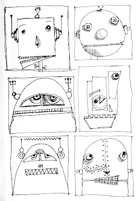
The picture above is a little creature that leapt into my notebook without me seeing him. He is smile-y but could bite! Watch out!

Tara's Production Blog


Tara McPherson created a step-by-step production blog of a screenprint she did with the Austin, Texas based Decoder RingDesign Concern. Check out both links. Enlightening. Like lightening! Thanks to Juxtapose for posting such an eye opener and paying attention to the import of understanding production as a way to good images...versus just the painting. You do not need to hear me rant on that. I did that last year about this time. I will need to give you another six months before I go off on production importance for illustrators. But, hush.

K and I love Tara and her work. And it seems, Tara Loves Her Work too. We just got a terrific book just on Tara and her work--showing the illustrations from rough sketch, to hard lines on trace to final paintings or screenprints. Very doable and understandable...and a real source of inspiration for K.

Tara McPherson Book

News from the Academy of Fine Arts


The Rongovian Academy of Fine Arts is delighted to be part of the Delightful Blogs directory under the Art designation. Delightful Blogs is a fun, edited site filled with all sorts of fun blogs that one might never bang into--but would love it if you did. I saw some cool retail links yesterday and a nice blog put out by a husband and wife team, The Wiebners--and their travels and photos for weddings, families etc. Their work is clean and happy...maybe a little too happy for this art director, but the folks that hire them must be absolutely delighted with the work they get. If K was getting married, I would def. call them. The Academy values all work. The shopping sites look like a fun time during some down time.

Working away on work. Updates to come on FreeRange and their "world tour">>
More later>>

Springing


I want to sing the praises of a new website/community called Illosaurus. This is how they describe themselves: illosaurus aims to offer the illustration community a single point of reference for all its business needs. The site encompasses a unique list of resources and recommendations aimed at the freelance professional artist: everything from useful tools for self-promotion and workflow through to advice on tax and copyright.

And, though they are new and growing-- it feels as if illosaurus will be a great resource for all of us who love illustration and the world that surrounds it from the profession to the cool stuff we get to buy to do our work. The illosauri are looking for links to resources you have used or know of in categories from art supplies to type and much more. Stop by, say hi and leave a little calling card or a resource.

I figure anything the great Ape (the ape leader of The Little Chimp Society) is involved in will have good energy and be a fun place to visit.

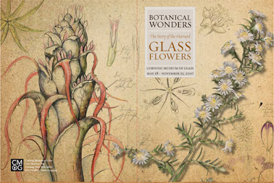
Good response to the work in progress with the dogs. Psyched. Maybe something will evolve. Two clients are already talking about Christmas cards. Imagine. More good news--the presskit we designed for the Corning Museum of Glass for their new summer show, Botanical Wonders: The Story of the Harvard Glass Flowers won a first place in the Press Kit category for the AAM (American Association of Museums). The pullout copy on the AAM site said:

"The folder has a texture and pattern repeated throught. They thought through the branding from the inserts to the CD lagel to the postioning of the business cards. It has simple but beautiful packaging. We thought they were real--not glass--flowers."

Whoa. To think they could be so nice. That presskit was a real toughy as there initially were not many pictures and a bunch of drawings the Blashka's did in preparation and design of the pieces before the lampworking began. So, with a hodge podge of stuff...we took a scan of an ratty old piece of paper and began to start layering, sihouetting and moving the pieces all around to get the general look. The idea to continue the show brand to the enclosed CD and print pieces was obvious. Its always an interesting process as the presskit needs to be designed at least six months before the show opens and the Museum team is pushing ideas around..but there is no single image to work with. The presskit is the kickstart to the visual clues we will be working with in the pubs etc.

More later>>

Back to the Doghouse


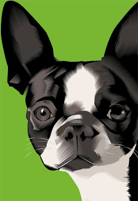
This Boston Terrier is the beginning of a new body of work on dogs. Happy dogs, leaping and snarling dogs, play on words dogs, playful dogs, faithful friends. Canine confusion. Canine cacaphony. There is a world of opportunity to this content and I am psyched. This head is from a dog I am working 24' x 36" and found I was getting way too tight. This final image is 13" x 19" with the detail still holding. I started with black and worked in the midtones and highlights and have questioned this approach, but I like how the black makes a lot of decisions for me...and I can really block and tackle with the highlights and midtones in a very simple way. So...you will see this evolve. There will be a sidebar blog to the Rongovian Academy of Fine Arts relating to this body of work...showing work in progress. Look for A Pound of Rongovia to see the work progress.

Clicked to this interesting site from The Little Chimp Society called Illosaurus. This is a british site whic is "the brand new listings and information portal for illustrators, cartoonists and image makers". There are links to AOI (Association of Illustrators) and other big british sites for illustration, cartooning etc. They have some sketchy vendor lists (feels brand new--I am hopeful this will expand)-- with a cool link to a teeshirt vendor in California, Ape Do-Good Printing. Not clear on the printing but they talk about Pantone colors, special colors and have templates in Adobe Illustrator to download to comp the designs for designers. Very proactive. They also print posters. I will call to find out if the posters are screenprinted etc. Right attitude. Right tools. Cool blog to point to their cool friends and customers.Could be a nice supplier for all of us to have.

Just got a postcard from City Colors(??anyone know them)who are big and cheeeeeeeeeeeeeap. Here's a "for instance"--500 postcards, 4/0 ($45), 500 postcards 4/1 ($50). These are good prices. I will need to get a business card printed from them (4/0) 500 qty for (yes, folks, what's wrong with this equation) $15. So, I owe you something on that.

We had the happy Festival of Flowers today in Tburg. Visited the new Main Street Art Pharm, a group of artists who have studio space and a shared gallery with an enterprising woman who makes lovely natural cosmetics. Best wishes to all of these engaged artists. Rumor has it that the old Holton pharmacy space is being divided to be a used bookstore and in the other half, an optician with glasses. So, more services and more retail on Main Street. Volume Records, our used and new music store has moved down to the Commons in Ithaca--and that space is being taken by a sweet shop. More novelty. Ran into all sorts of fun people in my travels. It was energizing to be amongst the tribe.

Jay Hart


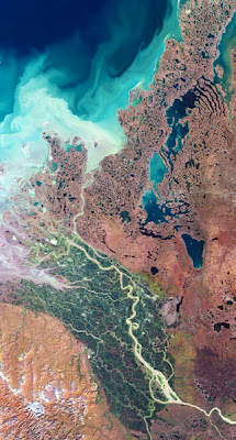
We walked into the State of the ArtGallery yesterday to be surprised and wowwed by Jay Hart's magnificent maps. And to our pleasure, Jay was on call that day at the gallery. I really don't feel that I can do his work justice by rambling on in my random manner about his work. Go see it for yourself>> Here is a little of what Jay says about himself:

I want to introduce people to the broadscale beauty of large swaths of earth, with perspectives that are fresh and penetrating. In doing so I also want to simplify our view of that big world, so that we can feel at home in a broader sense, becoming inherently less anthropocentric, and approaching each other with a high level of respect for our diversity.

As we trace the paths of our daily lives, we become used to thinking of the spaces around us as linear, routine, even dull. On trips to faraway places, we measure distance in travel time, too often ignoring what we have actually driven through or flown over. We think we know the world we live in - we have a glut of digital information about it - but most of us perceive it only within a confined personal range.

Jay translates that "glut of digital information" down to sheer elegance and a new way of looking at who we are and where we are. New context setting that shifts one outside into the abstract and then back to reality. His huge output is glorious in it's size, detail and 20/40 sharpness. His respect for this work eliminates glass and to a large degree any frame...allowing the work to speak for itself. Magic.

As an aside, his links and other information makes visiting his site an afternoon of discovery. It's rainy today...visit another place with Jay., and did I mention, he is a Trumansburger? I guess we might honor him with the honorific of First Cartographer and Master of Topology to the Court of Rongovia? The Director of the Academy is delighted to know that Jay is in the neighborhood.
____
Jay Hart
A Brief Thaw (details)

print size: 71 in x 40 in, 181 cm x 102 cm
print resolution: 360 dpi
file size: 977MB, 12866 x 24042
number of images: 2

center location: N 68.9, W 133.7
approximate scale: 1 to 200,000
ground cell: 14.25 m, long side: 343 km

Snow predicted.


New tools in action. Kitty asked me if I was going to talk about my pens this morning on the way to school. I guess I am getting tedious--so much so, my daughter pinpoints exactly what is working this week for me. No, I answered her, I talked about them yesterday. URg. My plan today was to point you to this cool blog "comic tools: snooping into cartoonists' toolboxes M-W-F". MK Reed asks illustrators about their tools, inks, pencils, etc...down to the weensie details and a discussion on working technique. She links to the artists' websites, cites their training and expertise. Its great, affirming and opens up other techniques/materials. Overall, everyone adores the faber castell Pitt Pens (which I have praised as well). I love Neil Swaab's entry (he is blogged here at the RFA) and Matthew Bernier's detailed information on slow lines and fast lines, high carb--down to the watch out on how to buy a brush. Bernier's blog is illumninating too>> Here is Bernier's advice--

"Advice: Don't become like me. No, really though, good tools do help. It's true that a great artist can make good comics with the worst pen available. But- I could never get the exact kind of line I get out of a good brush with a bad brush. Bad tools slow you down, break your rhythm, harsh your mellow. I pay good money so that I can know for certain that any problems I have at the drawing table are my fault and not my tool's."

Right on.

>>another interesting looksee at different brush pens. I love my fellow bloggers as they share the wealth and opinion. >>