Feathered fun

Images of KamadevaKnocking em down. Alex is done with his exams. Kitty has a little summer bug. Mr. Percival B. White has settled in…with lots of lolling about, sleeping in odd places, cuddling with shoes. Nigel is done this week— he has a little trip planned. Rob is Manager on Duty tonight…so he will be running late.

More pictures of Kamadeva. Love the parrot made up of green sari’ed ladies…or the little cart pulled by a pair of birds.

From Indian Divinity:


Kamadeva, the god of love, is very fair and handsome and the best looking among the gods. He carries a bow made of sugarcane and strung with a line of humming bees. He shoots with his bow the five flower-tipped shafts of desire. RATI (passion)his wife and his friend VASANTA (spring), who selects for him the shaft to be used on the current victim accompanies him. Kamadeva’s vehicle is the parrot.
Lovely, lovely exotica.
Now for a channel change. Jim Reidy told me about this fabulous, free presentation site that one can create truly cool presentations in a distinct, non linear way. Prezi.com—defines itself as a “zoomable interface”. Not only is it cool as a way to go beyond the stupidity of Powerpoint—but as an artist/illustrator/ designer… thinking of this medium as a way to tell a story is very cool. Need to fiddle with it a bit…but the ability to zoom in /out can add focus, and draw the viewer in to a story. Take a look.
One more exclamation on the local level. We have a bulk foods store moving into the former Artisan Cafe space “Good to Go”! I found out about this on 
Facebook as they are vetting their logotype to the group at large…So, another new retailer in our little hamlet.
More later.


whirl


I am in a miasma of ideas, things to do, things not to do, packages to send, people to call, chores to do, clothes to fold, leftovers to reconfigure. The sublime and the ordinary and somehow I am stuck dead in the middle. A bit stunned, but in the middle. The ideas that are whirling vacillate between the biography I am reading in Julia Child and the informal research I am doing on the German Pietist in Pennsylvania -- their life, their lifestyle, their art, their healing practices, their philosophy...so the middle is an odd place to be. The only similarity that these topics have is that it about people who have strong beliefs and are committed to doing the right thing with those beliefs.

Julia Child was someone who pursued her love of eating to that of cooking to translating that discipline of French cooking for the layman to experience. She introduced measuring and repetition to the processes that were art to the French. She was always drilling down and asking herself if the newly wed wife who was cooking from her book could follow her writing. She refused to dumb down her roast chicken to a mere 24 words (as her competition did)--simplifying but not compromising her beliefs and not giving the editors a "ladies magazine" approach to the cooking she loved and believed in.

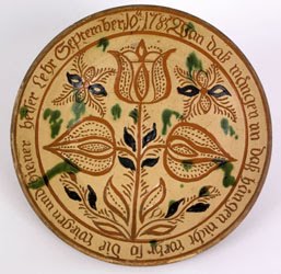
The Pietist....No compromise, all passion...afterall, they were Germans. Everything exuded their belief from their art, to the healing invoking the Virgin or Jesus, to the blessings on their houses. They were not dour in those beliefs. Conrad Beissel (1690-1768), the founder of the Seventh Day Dunkers (another name for the German Baptist Brethren),a hermit and then founder of the semi- monsastic community at Ephrata, wrote hymns galore. (I have found there was a real flourishing of hymn writing in Pennsylvania during this period with the Quakers, Moravians etc. to name a few groups)). His hymns were then embellished and designed within the community and either hand done in a scriptorium at Ephrata (one of the tasks the sisters did) or printed (Ephrata had one of the most significant presses/printing operations at the time...working alongside Ben Franklin who also printed some of Beissel's philosophy tracts). These hymns were embellished with flowers, crowns, birds, angels/spirit guides, hex marks, little faces, sometimes unicorns, sometimes lions. All in brilliant red, yellow, blue, brown and black. The same color palette and spirit we see, not in the spaces at Ephrata, but in the Peter Wentz Farmstead with the brilliant yellow walls and bright blue built in cabinetry. And the enormous black polkadots adorming those bright yellow walls. Nothing dour there.
---
Alex has pink eye and at the doctors as we speak. Kitty still sleeps (I am going to wake her up as there is work to be done). Rob and I are making lists of things to be done in town and here from bulb planting to spackling and sanding walls. I think th ere is lots of work to be done...and my time here is needed elsewhere.

ps. The images of Penelope and the Gorgon I posted yesterday are sketches for a theatre poster for a future Hangar production....

whirly


Feeling busy and stale. Sad. Might be that I am a bit housebound...but the work is frustrating and fast...where a more sophisticated approach isnt understood (more color is better and please fill up all the white space...). But I am feeling stale and inept with illustration (I have no idea...but my confidence is in the crapper. Its been only 3 days of just us...so I need to give it time... and we are expecting an impromptu guest tomorrow night. I will not have a chance to prep the room, make up the bed in advance...Rob is in two all day meetings with dinner tonight. The truck is still broken, so I am situated at the Camp House with nothing to drive. Enough kvetching...? Sorry.

I am using the new things I learned with Jean and Nancy (brush making, live paint, live trace, "average" points) and I am surprisingly making some productivity strides. Additionally, I am reading two books on illustrator (one paper book, another on my kindle and picking up all sorts of other new stuff along with the power user stuff (like the minus sign is the minus points key)...

Whitney Sherman, Chair of the Illustration Dept. at MICA (Maryland Institute College of Art) broadly asked for names of books/etc. for the History of Illustration she is teaching this fall. However...good things flowed from this call for entries--this marvelous, eccentric, smart and illuminating blog surfaced, "A Journey Round My Skull" captioned as ""Unhealthy book fetishism from a reader, collector, and amateur historian of forgotten literature." Recent obsessions: illustration and graphic design." Will, the author surfaces interesting and new people everyday along with smart mini "bloglets" on illustrators, ideas (like beards)--a magic place where Will's imagination captures ours and we soar together.

Take a look. Click through the placeholder pictures on the right. Interesting and a big time consumer.

Time to take Kitty out for a sandwich!

jewels from ebay


Name: Doris Lee
Artist's Date: 1905-1983
Title: Blossom Time (Woodstock)
Medium: serigraph/trimmed margins
Signature Placement: Estate Stamp Verso
Size: 18x24

Name: Doris Lee
Artist's Date: 1905-1983
Title: Bird & Vine
Medium: serigrah
Signature Placement: LR
Size: 17.5x12.5
Reserved: No

Name: Doris Lee
Artist's Date: 1905-1983
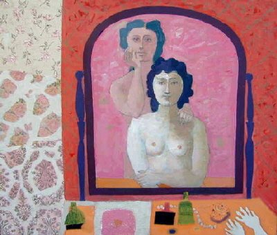
Title: Reflections
Date of piece: n. d.
Medium: lithograph
Signature Placement: LR
Size: 21x17
Reserved: No
Condition: good

Name: Doris Lee
Artist's Date: 1905-1983
Title: Poster for Memorial Show at WAAM
Date of piece: 1984
Medium: commercial Lithograph
Signature Placement: Unsigned
Size: 28 x 16-1/2

Name: Doris Lee
Artist's Date: 1905-1983
Title: Fruits & Vegetables
Medium: lithograph
Signature Placement: Unsigned
Size: 17.5x23.5
Reserved: No

Name: Doris Lee
Artist's Date: 1905-1983
Title: Christmas Fruit
Medium: serigraph
Signature Placement: LR
Size: 24.25x30
Reserved: No

Name: Doris Lee
Artist's Date: 1905-1983
Title: River Bathers
Medium: lithograph
Signature Placement: LR
Size: 11x16
Reserved: No

Well, dang. We were talking about Doris Lee and her husband Arnold Blanch so I went to my favorite mall, bookstore and gallery and googled her. There is an auction of prints and originals that I gleaned these images from and wanted to share with you>> I can editorialize forever on this work--her primitive forms, simple color and the twisty twirly line work that gives it a sense of humor and charm. I love how shapey it all is. My next Garden is going to be inspired from these, these very images. This work speaks to me.

In a Twist


Doris Lee
Woman in a Garden
20 x 29 7/8 inches
framed: 27 x 36 inches
gouache and watercolor on board


Doris Lee (1905-1983)
Fruit with Bottle Still Life
13 3/4 x 18 3/4 inches, oil on canvas, signed lower left


Doris Lee
American (1905-1983)
Ladies' Luncheon Club
Oil on Canvas
50 1/2 x 20 inches

"Ms. Lee once said of her motive for art making, “What I feel is a sort of violence,” a quotation that was repeated in the press far more than she would have liked. I think this “violence” was simply ambition — lots of it."
from NY Times article by Roberta Smith

Murray talked about Doris Lee and her husband, Arnold Blanch as part of the group of painters/illustrators who were setting the stage for the storybook illustrators such as Alice and Martin Provensen, Mary Blair, Art Seiden, Jan Balet. Murray said that though Arnold Blanch and Doris Lee were lesser known painters of the time, but their circle which included Stuart Davis and Milton Avery which suggests their style and approach. The New York Times in April (2008) had an article that started with almost a warning and evolving to an embrace of Ms. Lee, her work and the show at the D. Wigmore Gallery that showcased many works from her estate.

Look at that palette. Look at these simple compositions. Her figures reference (in this group) Milton Avery and in some cases Morris Hirschfield. Her palette parallels Milton Avery's late work's palette. Look at how she handles the flowers in the composition with the woman. Look at how Arnold Blanch handles the same thing (below) And Arnold's women really are inspired by Picasso. Wow. I am going to explode!

I am spinning. My head is spinning. I am trying to figure out what I am. Topsy Turvey..but with Murray pointing to Doris Lee and the list of artists I need to see...there is something there...but I have this tree to do...and am going somewhere, but down the wrong alley. But, I like Leonard Baskin, Eleanor Ness, Harry Clark and a bunch of line folks too. However, I need to keep going and make some pictures to draw my way out of this one. Heck, I got through the whole mortality thing through 300 drawings about death and mortality. This should be a walk through the garden to partake of the Tree of Knowledge. At least, there is hope.

Arnold Blanch
Two Women

Arnold Blanch

Morris Hirschfield

Bizzy Buzz Buzz


The bees (above) were photographed at the lovely farm wedding we attended a few weekends past. I was charmed with the hive surrounded by queen anne's lace and grasses along with the actual bees--flying towards their home, ignoring us and happy to amongst themselves. I am a bee lover from way back...I love the way they look, the simplicity of keeping bees, and the symbolic aspect of bees. Napoleon represented himself with a bee as did royals. The bee is used by the mormons as a representative of their productivity and community with one of Brigham Young's houses called the Beehive. A member of the Freemasons in Mill Valley wrote a wonderful paper on bees and what they mean here>> Dig this:
"...the emblem of the bee hive is found in an Irish expose called The Early Masonic Catechisms printed in 1724:

"A bee has in all Ages and Nations been the Grand Hierogliphick of Masonry, because it excells all other living Creatures in the Contrivance and Commodiousness of its Habitation or combe; … nay Masonry or Building seems to be of the very Essence or Nature of the Bee, for her Building not the ordinary Way of all other living Creatures, is the Generative Cause which produces the Young ones. (you know I suppose that Bees are of Neither Sex.)

For this Reason the Kings of France both Pagans and Christians, always Eminent Free-Masons, carried three Bees for their Arms.

What Modern Masons call a Lodge was for the above Reasons by Antiquity call'd a HIVE of Free-Masons, and for the same Reasons when a Dissention happens in a Lodge the going off and forming another Lodge is to this Day call'd SWARMING. (wording and spelling of 1724)" (Roberts, The Craft and Its Symbols, p. 73)

I was at our local Farmers Market and found the Bee man, Mr. Waid from Interlaken who had big beeswax pillar candles and bee pollen for sale. Of course, I had to buy it...and spent some time talking bees with him. He and his wife told me that they rent their bees to farmers for $70. Mr. Waid puts them in his truck (?moving the hive?) and takes them gently down the road. Unloads them and allows them to help pollinate the farmer's field and then, brings them back to his place. Then they exolled the virtues and values of bee pollen when you ingest it...preventing or mollifying allergens in the air. Local pollen and honey> Local bees> Local environment that we are part of . Nice understandable cycle that makes sense to me. Anything to reduce the need for seldane or any of the other magic drugs that are almost necessary on the shoulder seasons.

So, bees are deep, cool and beautiful. Hold that thought for some pictures.

I am very pleased to have gotten 12 pieces out to the Society of Illustrators LA show yesterday. It takes a bit of time to get the files all right and tight. I had a nice chat with Alice from SILA who was helpful in explaining work arounds in getting the files to them for the show. Its a bit hinky with their new tool, but the thought and intent is good. It will be better, I am sure, next year. But hey you guys, if you are entering, the last day is September 19th....and we should know who is in, and who isn't by Thanksgiving! SOI NYC is coming up too, so the SILA prep will get you ready for the New York show.

Murray pulled me out of the mud yesterday...pointing, nudging and guiding. He was talking about the topic of Adam and Eve/Garden of Eden saying that this here was something to get my teeth into. He thought the monkeys needed a rest. He suggested I look at Today's Inspiration for the new writing and images of Jan Balet.


Jan Balet from Today's Inspiration

Also to read up on Doris Lee, her husband Arnold Blanch, Milton Avery and others who really set the stage for some of the storybookartists such as the Provensens. There is a lovely exhibit of Doris Lee's work at the D. Wigmore Fine Art site>> Okay, Murray--I am beginning to see it...

Doris Lee (1905-1983)
Woman in a Garden
20 x 29 7/8 inches, gouache and watercolor on board, signed lower right

I got off the phone feeling the rock off my shoulders and fired up to learn about these artists and two, to get going on some pictures to do with the Garden Story. I am shifting gears and will present this as a slick cover for a children's religious magazine..or myths and legends thing. Murray suggested (as I will chase this for my thesis) that this become a children's book. As usual, I was negative, but after a night's sleep and a bit of thinking...this is probably a good idea. I think I do not worry about making is super sweet...just in doing a bang up job. Maybe R. can help me with the simplifying of the story. This is great. Simply great. I can draw this stuff for a year, no problem.

We also talked about drawing and the computer. My thinking is that the computer freezes an illustrator because making perfect curves and flat shapes has a draw for an artist as the appeal for perfect is alluring. I have been sucked in by this. However in losing the drawn line, the quirkiness of the hand of the illustrator, the errors and wobbles, the life is gone from the drawing and becomes perfect shapes, logotypes without a soul. I think if I can come up with a working method paralleling the Ron Mazellen approach, where the computer helps to refine, becomes a method of hastening the mid steps and becoming invisable in the final product this shold be my goal. I know in the vector approach I started at Syracuse, there is the intent to have the work look like screenprints and actually reduced the process down to working in vectors and the pathfinder tools to hasten the process along. Only flat color (like screen prints) reduced palette (the now thinking) and shape reduction...breaking it out like circus posters or prints...that the imprint of the computer was diminished. Now the challenge is to do the same with the hand drawn image. I think there are some tricks here....

Gotta go. Like I said the other day, there may be a trip to Aurora today! I'll take my picture machine! More later.


It was a perfect evening with a sunset blazing and turning the water from a tropical blue to purple all in the span of about an hour. Fireworks to celebrate K.'s foot surgery which was done and over to all of our happiness.

I am getting fired up to be Manhattan Q.--take no prisoners, drill with constant phone calls--push,push, push. Need to. Being nice--you get 5 strikes before this clicks in. So, hello me, meet the tough me.

I spent a little time this morning with my Dover book on Kay Nielsen and feel that I will probably have that at my elbow, hoping if my brain can't absorb it, my elbow can. I love this guy. Talk about obsessive decoration...whimsy. And interestingly enough, from a theatrical family so I like to put that lens on looking at his work...because it makes more sense. I love the way Nielsen describes his foreground/ background as they are rendered as the layers or scenic flats are on a traditional stage. He will use drapery in the foreground to draw your eye, or just a a little detail to say, "I am the top of this illustration". The top illustration is one that we saw at the Eric Carle Museum's show "Flights of Fancy". This was a confection (in real life) of delicate color (which the photographic images lose to just gain color on press), tiny pen and brush work, an oriental rug of color, linework and pattern and the sheer imagination in creating such a work. The central female is exquisite..with her face overwhelmed by the design of her hair, her dress, her environment. An amusement, take a look at her foot, his foot and the Oriental man to the far right...check out their sizes...! And the black and white line image below is beautiful in it's restraint in the line and pattern. Almost a point/counterpoint to the image at the top. I am showing the king below for its symmetry, the use of black and the candles. Love the candles.

More great illustration news:
A wonderful story on Murray Tinkelman will be in the next http://www.illustration-magazine.com/http://www.illustration-magazine.com/ (Issue 23). You can see thumbnails of the publication in advance>>. I am subscribing today. Put it off for some reason, but now reason to get back into that.

The wonderbus is ready to go. K is out of bed and is clunking down the stairs.

Gotta go.

Barometric shifts


A door banged closed and woke us up last night. R rolled over and was back in his dreams. I, however, had started the whirring gears...so I flipped and solved at least half of the world's problems. Shady and the cats were up, patrolling in the change in the air. Ticking claws on the wood floor. The wind kicked up putting white caps on the lake waves, with an ermine sky--with a tiny hope, a tiny peak of a blue sky and a rosy tinge to the clouds beyond. It was pouring early--but I hope it will stay for a while as A has training at Taughannock Park with running on the trails in nature. He was looking forward to it, so we can just hope its not in a downpour. According to A., this is not a problem...but as him mom, I don't love it.

However, I did get my iPhone to sync with my calendar, so that is really good and very exciting. More bang for my iPhone buck. I also posted a link to my illustration site with the Fort Worth Buffalo to Little Chimp Society (a European illustration networking/ promotion site). I have put some of the recent music related work and a button for decorative illustration on the qcassetti.com site.. I think this decorative illustration should, instead of just being a category, should open onto a decorative page where the Memento Mori work can migrate along with the little things I seem to be doing. As this is the thrust of the next year, I should give it a real home versus just a click.

And, we all need to think (soon) about the Society of Illustrators LA show entries due mid September. I think the Buffalo, Carol Elizabeth Jones CD, and some selections from Memento Mori. I really did put quite a bit of time in that pursuit...so I should see if there is some traction. One of the shows selected one of them...so its a new year...and a chance to see. By next year, I will have thesis work and probably a good 12 other images ready to submit. I just need to breathe and put my head down.

While I was trying to stop my brain last night, I read a week or two of Today's Inspiration following the life and work of Robert Fawcett and followed an interesting link to the CAW blog Charlie Allen's Weekly Scan. Charlie is very funny in his observations and collection of images (today its the woman of steel, further down is a nice study on hands...and so on). Take a look. Thanks to Charlie and the discussion of hands, I was able to still the whirring gears...and dreamland welcomed.

Today is a panoply of stuff to do: there is the chauffeur service, work, meeting with the college counselor, and moving one kid, picking up the other and working work and phone calls into the mix. Thank goodness tomorrow just has one kid activity...as the tsunami project looms.

More later>>

Monkeying around


Need to get stuff out to 3x3. Corrections for the Museum's calendar. Newsletter layouts for a marketing group. Still working with the monkeys. Was looking at some reference and had a little epiphany...the pix are getting more interesting. I figure if I give myself until Labor Day, I will be on to something for Vin. I know that this is not real world for jobs...but, this graduate stuff is not real world anyway and I should wallow in it. Wallow away!

R is out for a conference. More painting here. More moving of old materials. Big dump run. A. at friends. K. having PSAT training and then history book stuff. Need to get in front of the school year before the end of the summer. Will need to find a geometry tutor. Lots beginning to mount up prior to September 1.

Was swimming in the book The Animal Farm. Cute as pie with some strong references: Grandma Moses most particularly. That Alice and Martin...writers and illustrators! The little bit on Hibernation makes you want to lie down and sleep along with the bear.

More later.

six layouts, one color


Due Friday. I had all of mine thrown out. Entirely...so I am on the hook. So my mood and view is pretty neurotic and nuts...as I feel that I am just this side of the "special ed" room. My lines dont seem to work to match my brain. I am tumbling and rolling...in a very uncomfortable spot. As dear Ron Mazellen told me frankly, " you should feel that way...if you didn't nothing would be happening" and coming from that superstar painter illustrator...maybe I should just be patient with my pain and wait. Let it all percolate. Channel the happy vibes and beauty from Aubrey Beardsley and Jean Tuttle, Ludwig Hohlwein, Wanda Ga'g, Virginia Lee Burton and the newest members of the happiness parade, Alice and Martin Provensen's Animal Fair ( the first book Murray Tinkelman bought after his military service which, to me, is the cutest thing in the universe). Deep breath. Murray has been wonderful talking me off the ledge. He has said its okay for me to make spot illustrations, but we need to do the other thing...address the top three: horizon, reference and light source-- and make a real picture with a context, a placement, a horizon line.


We had a nice day of work--albeit mine was complicated and pretty unproductive. Tomorrow, its headset on--Ms. NonCommunication, Ms Leavemealone. Gotta buckle down, machine mode--and blast through this. I have my first thesis meeting with Doug Andersen which I am going to surface as an exploration of decorative illustration>> going deep. I plan on writing about Jean Tuttle and her work and look forward to Murray's talks next week on Decorative Illustration  as a second hook to get me going. I need to seek and develop. 

We had the Texas crit with our posh Residence Inn making us hamburgers and hot dogs. The work from the Texas Trip was unbelievable with my favorite, absolute favorite coming from Dan "the Man" ( was totally charmed by his witty tumbling cowboy and psycho cow) , with close seconds from the amazing painters in the group. Lori Ann Levi Holms knocked herself out with another tour de force 3-D interpretation of Texas. Unbelievable. She made cows and cowboys out of clay (glazed and fired) about 4" tall which she mounted in a foosball format (and they moved) with a painted background that absolutely rocked. Everyone laughed when the idea was floated that this was "art" and you know, I totally agree. This foosball Texas piece would sit in Miami at Art Basel Miami, NO PROBLEM. It was beautifully rendered...perfect.. She then brought down her children's book--another amazing 3D, working model. ROCKS. She is an amazing energy. Speaking of amazing energy, Jackie Becker did it again with a Cowgirl Armadillo--even better that the perfect Pasadena Garden Party Bear. The personification of charm. Mardi's  pastel and gouache longhorn was unexpected and amazing. Chuck Primeau's Bacon/Action photo kinetic inspired cowboy being thrown from a bull was startling and another testament to his skills. The whole experience was a rich slice that I was delighted to partake of. The crowd liked both the Buffalo head and also the armadillo (which was a nice/nice but not a true picture for that assignment). Very positive...given the garbage I am generating by day.

Dennis Nolan gave us a lovely presentation of where he started, where he went, were the work goes and so on. His work is exquisite-- and meaningful. I loved his books, particularly the Once and Future King project which is quite beautiful and rich. Dennis lives in the detail...but his layouts are exquisite. He works in a limited palette--and builds it up in color from yellow, with red on top and finishing with blue--layering the color, building up the detail. It blows my mind. Makes me think about a limited palette beyond black white and a color. Hmmmm.

Its late once again. I am yawning so wide it hurts my jaw. Pray for productivity.
Peace.

Dark Clarke


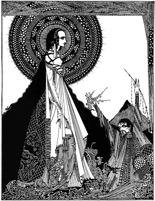
Tales of Mystery and Imagination
by Edgar Allan Poe
Illustrated by Harry Clarke
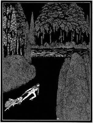
You can click on these to get a bigger image that can show you how unbelievable the detail is on these pictures. From my Googling, there is a recent irish film on him "Harry Clarke, Darkness into Light"...and they did cite that he is one of the monumental irish artists who is quietly unknown. Not only do I love the detail, the patterning but the powerful compositions he uses to up the ante and draw the viewer in. His work is surprisingly emotional in these Grotesqueries not the candy coated happiness that the fairy tale work communicates. And even that work is not so sweet...

More later, work and coffee await.

Wow!


Another unexpected garland from Hartford. I have been granted a merit scholarship from the University of Hartford. How wonderful! Now the pressure is on...and what with my muddle and confusion...it only sullies the mix. Man, I am nervous.

Post looking at the I Miller Warhols, I had a great idea for a book on color for littles...with spreads on each color--with these "scientific specimen case" type of pages that stack out all sorts of things that are either the color or bear the name of the color in the name of the thing. Maybe some little type things throughout...so there is lots for the young reader or little person and their reader to read and discover. Could be cute.

K and I may do a little book on Mr Grumpy, our cranky boy cat...who always is guaranteed to get up on the wrong side of the kitty litter every single, solitary day. He always is swiping us, crankily telling us its time to eat. He does bow to the superior cat,(read dog) who he accompanies nightly on her walk, serving as the court of honor along with his bookmatched companion cat, Mei Mei. And, if we don't behave, he will poop in the tub to show us who is boss. I will write and layout. K is to be the illustrator. We casually write it when we comb the cats/superior cat....and scream with laughter. So, hello project, hello LULU.

night!

Little bits of Weaver


Overview on Seeing is Not Believing: The Art of Robert Weaver
at the Norman Rockwell Museum, Stockbridge, MA
November 8,1997- January 25, 1998>>

"stop being conceptual and get back to looking at things, at the details...to observe light and color and pattern." Robert Weaver

Good article. Good insights including his teaching at Syracuse and School of Visual ARts for 30 years(who would have known), his use of different media and actually putting him in context with Jackson Pollock and Willem deKooning. I wonder where the 100 pieces of work reside?
I wonder if there is a catalog. I am going deep on this one.

Also, Leif Peng in his observant, beautifully written and illustrated Today's Inspiration blog talks about Robert Weaver in his February 26, 2008 post. He surfaces the Rockwell show, cites the link to Bernie Fuchs and observed interestingly:

"The article there confirms what I was saying yesterday about this new breed of illustrators having one foot in the commercial art studio and the other in the fine arts gallery when it states, "Weaver was among the first to wed fine art to applied illustration" and goes so far as to call him "the godfather of the new illustration."

I like it that Peng, an illustrator, poses questions relative to Fuchs and to Weaver, open ended queries that leaves me puzzled (charmingly so). Here is a link to Peng's Flickr set on Weaver>>

Steve Heller in his article " The End of Illustration" posted on the Illustrators' Partnership site
puts Weaver in a historical context of illustration and art:

By the mid-1950s modern painting influenced illustration, and a few young illustrators challenged the hegemony of the academic realists. The old school was known for slavishly, though meticulously, rendering exact passages from underlined texts (usually assigned by editors). Conversely, the young turks established moods through the expressive application of color and form in paintings and drawings that wed realism and abstraction. The human figure no longer had to be an exact replica; backgrounds did not have to be thoroughly researched; verisimilitude was not necessary for a successful image.The late Robert Weaver, one of the pioneers in the shift from neo-Rockwellian academicism to representational expressionism, explained that this was the beginning of a time when illustration was used to portray heretofore ignored themes and taboo notions.

Now the illustrator was required to express ideas rather than mimic verbatim scenes: "We had to show the notion of left-handedness and depict crime on the street," he once said, "not a couple on a date."

The "new" American illustration of the mid-1950s can be summed up in one word: Conceptual. Illustration evolved from what-you-see-is-what-you-get to conceptual because the issues and themes covered in magazines were becoming more complex, more critical. Although most neo-Rockwellian illustrations were based on a broad idea, these illustrators rejected illusion, metaphor, and symbolism in favor of the explicit vignette. Precise physical detail was more important than psychological enigma. Even Rockwell's own paintings, which were influenced by allegorical painting of the Renaissance, were precise scenes void of the ambiguity that invites a viewer's deep interpretation.

The younger artists of the 1950s, among them Weaver, Robert Andrew Parker, Phil Hayes, Al Parker and Tom Allen, not only painted in the automatic manner of the Expressionists, their images were designed to be deconstructed like poetry. By the late 1950s photographers vividly captured the surface of things, leaving depiction of the interior world to illustrators. As TV eroded popular interest in magazines, expressive and interpretative illustration offered alternative editorial dimension. Illustrators were given a key role in the phenomenon known as "The Big Idea," which was an extraordinary confluence of rational graphic design and acute visual thinking. The rise of conceptual illustration during the 1960s, furthermore, was marked by an unprecedented collaboration between illustrator and art director/designer because illustration was viewed as an element of design—but design was not only about simply making special effects on a page, it was about making messages. In the Rockwellian era, the art director would position the painting in a layout near the appropriate text. In the new scheme, art directors worked with illustrators on concept, composition and layout, as well. Either an illustration was integrated into a format or given its own page adjacent to an elegantly and sometimes metaphorically composed block of text. Conceptual illustration served two purposes: It provided meaning—and commentary— and gave a publication its visual personality.

Huh. Neo-Rockwellian obsolescence. Expressing ideas versus mimicking scenes. Meaning and commentary. I need to understand this. How? How do I do that? Can I do that? I am scared by this...BIG Idea indeed. And, as I am an art director...phooey on that! There is something here. My brain is kicking into something new.

Later>>
Gathering of Hollywood Notables
Robert Weaver

eyes shut, wonder bread, pen on the end of a stick


Poor Terry Brown was on for early (7am) and it took a good 2 hours to get the digital projector to function properly--so the schedule slid around a bit to accomodate this change in schedule. Terry was very interesting--but oriented his discussion of illustration history around topics versus around trends/styles/timing/inspirations. We clipped through Winslow Homer all the way up to the work for Filmore West in less than an hour or so...around topics. I was glad I had the early grounding from Murray or my head would have been spinning. We watched 3 videos during the noon session (one created for one of the ICON conferences from SOI, another a promotional piece to develop funding for a possible full film on the history of illustration and the final a little clip of a video on NC Wyeth with reminiscences from his elderly children interspersed with family photos, paintings and stories. What a sad ending for Wyeth (he was very depressed and was in a car that stalled on a railroad track with his young grandchild (some say child via his daughter in law), Newell--and they both were killed. I missed the p.m. to get in front of the Whitney homework for 12 of us with only 2 scanners in the computer lab.

We all showed our slide shows to Whitney and the class. Very telling. The better the illustrator, the shorter and more to the point the slideshow. The longer the show, the more tentative, less developed illustrator. Makes sense. Just a surprise that was the way it all worked out. The show and tell took the better part of 3 hours to get through. After the slides, we were given the first assignment:

--take 4-5 pieces of wonderbread and make letterforms out of them (see entry above).
then xerox them.

--study the words: bread, eye, edge,stick. Close your eyes and draw the outside silhouette of the letterforms and the counters--or draw the letters (outside and then counters). Draw the words a few times. Xerox the words...creatively--blowing things up, finding interesting lines.

--tape a sharpie to the end of a long, wooden dowel. Pin paper to the wall. Holding the dowel at the end, write lines of copy on the paper. Xerox creatively--moving the paper on the xerox machine--creating new forms, stretching the image, folding the image etc.

Tonight we are to create scans (300dpi) 8.5"x11" of these letter studies and produce a burned CD for Whitney for tomorrow. We will be working on another in class assignment tomorrow.It was not quick going with the sleepy scanners we have...but its done. This work isnt completed.I will loop you in as we progress. Tomorrow pictures of the show.

I thought this was pretty fun. I was def. in the minority. Folks were actually mad about this work. Wasn't painting. Was something new...and Whitney through her words and books she shared with us is into the building and illustrating with letterforms. I am totally there. I am looking forward to tomorrow...I cannot vouch for my classmates.

She is very organized and succinct...and handed us a bibiliography sheet along with links she finds valuable. Some good ones:

Ed Ruscha: They call her Styrene, Phaidon Press, NY, 200.

Rothenstein, Julian & Gooding, Mel, More Alphabets and other Signs, Chronicle Books, San Francisco, CA 2003

Whitney was very interesting on her involvement in ICON, the trials of figuring out, planning and organizing this big event...and how sometimes,all the planning in the world sometimes does not guarantee success. The plan is for people to engage in the sessions, mix with others and have a chance to learn more about illustration and the services surrounding the practice.

Its late. Wonderbread on the brain. Hotter than you know what here. More later.

Lawson Woods


I was knocking around the web, looking at vintage circus posters stepping off from my post yesterday. The circus posters were on my mind--and I wanted to see where it would take me. In my travels, I discovered Lawson Woods, an illustrator in the 30s who did this poster. As I googled him, I found him doing postcards and jigsaw puzzles with this "Gran'pop" character who happens to be a monkey. Weirdly wonderful work.

Excerpted from "Been Publishing I'm Back":

Painter, illustrator and designer: Lawson Wood was born on 23 August 1878 in Highgate, London to a family in which watercolor painting had been a tradition for two generations. He was the grandson of the architectural artist L.J. Wood RI and eldest son of the landscape painter Pinhorn Wood. He studied art at the Slade School of Fine Art, Heatherley's School of Fine Art and attended classes at Frank Calderon's School of Animal Painting. His humorous, beautifully coloured work is technically superb and is still enormously collectable today.

In 1896 at the age of eighteen he joined the staff of periodical publisher C. Arthur Pearson Ltd He worked there for six years and it was there that he met his future wife, Charlotte Forge whom he married in 1902. At the age of 24 he pursued a freelance career, which would prove to be extraordinarily successful. He was published in some of the most prestigeous magazines of the day. These would eventually include The Graphic, The Strand Magazine, Punch, The Illustrated London News and Boys Own Paper. He also illustrated a number of books, including The Invaders by Louis Tracy in 1901 for Pearson.

By 1906 his comic style was at its best; clean-lined and colourful and his sense of humour sharp and observant. It was in this year and in those immediately following that he produced some of his most impressive work. Lawson Wood's popularity and his reputation as a leading comic artist were well established. He was especially noted for his "prehistoric" humor that paired stone age humans with caricatures of dinosaurs, like the 1903 example above (which appeared in the 1905 Printer's Pie in duotone). When the noted art instructor Percy V. Bradshaw created The Art of the Illustrator (a collection of 20 portfolios showing six stages of a single painting or drawing by 20 different artists), Wood was chosen to lead off the series - an indication of his standing in the artistic community. The final stage of his painting, "Ring Time" is at right.

Lawson Wood signed his work in several different ways. There are at least three different examples of the signature that were employed as his career developed. In his earlier work he used only the initials LW. He also used an elongated L with a dot in front. The dot symbolised the Christian name Clarence, understood to have been hated by Wood and abandoned by him at an early age.

An active member of the London Sketch Club, Lawson Wood was a close friend of one of its most famous and well-loved members, Tom Browne. The time of his membership in the early days of the century was his madcap Bohemian period, when the influence of fellow Sketch Club members, in particular Browne, is evident. It has also come to be recognised as his golden period artistically.

Lawson Wood was elected a member of the Royal Institute of Painters in Watercolours and showed prolifically with Walker's Galleries and Brook Street Art Gallery and also at the Royal Academy.

During the First World War, Lawson Wood served as an officer in the Kite Balloon Wing of the Royal Flying Corps engaged in one of the war's most dangerous tasks- plane spotting from a balloon. This he undertook with gallantry. Indeed, the French decorated him for his action over Vimy Ridge. Despite his active service, Wood continued to draw, and Dobson Molle & Co. published the patriotic designs he produced during the war.

Once peace returned, Lawson Wood's love of animals came to the fore in his work. To ensure accuracy of detail, Lawson Wood regularly visited London Zoo and a small menagerie in Eastbourne, The Wannock Tea Garden. Inter-Art and Valentine published many of his designs. He also set up a factory producing "The Lawson Woodies" simple wooden toys of animals, birds and humans to his own designs.

Lawson Wood gained immense popularity with his humorous drawings of comic policeman, dinosaurs, prehistoric and Stone Age characters, and apes and monkeys often seen performing absurd antics against immaculate, dead-pan backgrounds. Eventually Gran'pop, the artful ginger ape (see sample at right from the cover of one of the Gran'pop's Annuals and also used on the cover of the September 30, 1939 issue of Collier's), and the rest of the chimpanzee family were to bring him fame on both sides of the Atlantic. The Gran'pop's Annuals were a yearly excursion into comic absurdities that were popular around the world. Cartoons were made featuring these characters and, but for the outbreak of World War Two, would have been turned into an animated film by Ub Iwerks' studio in Hollywood.

Recognition was not limited to the artistic world: in 1934 he was awarded a fellowship of the Royal Zoological Society for his active work with animals and their welfare. He set up his own animal sanctuary for aged creatures.

Towards the end of his life he lived as something of a recluse in a 15th century medieval manor house which he discovered in the heart of Sussex and which he moved brick by brick to the loveliest part of the Kent and Sussex borders. He died there on 26 October 1957 at the age of 79.


"Gran'Pop" puzzle

Does anyone have any other information on Lawson Woods?

Winded


THE CHOLMONDELEY LADIES' (1600-10): Oil on wood, 35 x 67 in., artist unknown. It was owned by the Cholmondeley* family of Cheshire. © Tate Gallery, London Resource
*Cholmondeley is pronounced as Chumley (feel better? I did upon discovering this...I know I couldnt remember let alone wrap my mouth around all those letters and have it come out as something concievable.
While strolling through the Tate Britain, I was stunned by the sixteenth century paintings grouped as the "British School". The stiff, 1600s paperdoll qualities these images have combined with a purely english palette (which I had forgotten I adored...they sure understand grey, warm grey, gold and reds). Clean as a whistle. The jewel in that collection was this gorgeous picture of the Cholmondeley ladies or sisters. It is a total show stopper. I was literally winded by the wonderful naive qualities of the work while the subject matter is puzzling and intriguing. What is the story? Who are these women? Why are they woodenly holding these children, whose very knowing and calm demeanors suggest wisdom and patience beyond their babyhood. What is the message? Who are these women? Are they sisters or friends? Do they represent something? Look at their eyes...and the sheer perserverance these English ladies evince. Do you think they are doing all of this for the greater glory of England? Wearing those starched collars and boned bodices just after childbirth is a high bar...

There is a great Christian Science Monitor article that digs into this picture a little here>>

Historical references suggest:
"The painting was recorded in 1882 as "an antient [sic] painting of two ladies, said to be born and married on the same day, represented with children in their arms" in "the passage leading to the sleeping rooms" of one of the family's houses.

Hopkins guesses that the mothers may have shared the same birthday, though some years apart, and that "they may have been married in the same chapel." He further speculates that they may have given birth to either their first or second children "on the same date.""

The Tate details the image this way:
"According to the inscription (bottom left), this painting shows ‘Two Ladies of the Cholmondeley Family, Who were born the same day, Married the same day, And brought to Bed [gave birth] the same day’. To mark this dynastic event, they are formally presented in bed, their babies wrapped in scarlet fabric. Identical at a superficial glance, the lace, jewellery and eye colours of the ladies and infants are in fact carefully differentiated. The format echoes tomb sculpture of the period. The ladies, whose precise identities are unclear, were probably painted by an artist based in Chester, near the Cholmondeley estates."